Home Page
The Home page is the primary entry point for users visiting a website or application. It provides an overview and directs users to other sections or pages. The content may vary depending on the type of website or application, but typically includes a logo, navigation menu, hero section, featured content, and key feature sections.
Since the Home page is the first impression users have of a website or application, it's crucial to design it to be visually appealing, easy to navigate, and effectively communicate the website or application's value proposition.
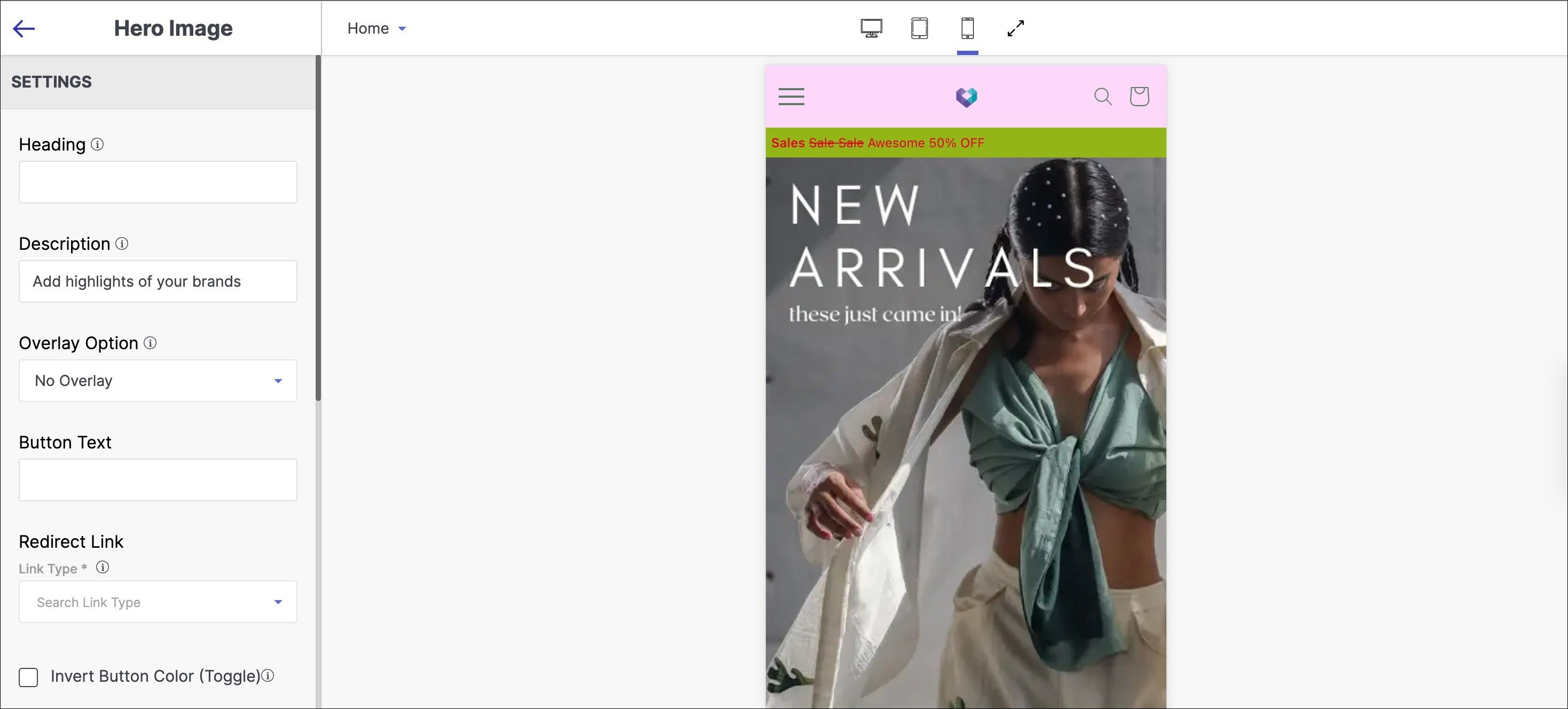
Hero Image
A hero image is a striking visual element at the top of a website's Home page. Its purpose is to capture users' attention and convey the website or application's main message or value proposition in a visually compelling way.
To add a hero image section to your website:
- Go to the appearance section of your theme and select 'Edit'.
- Click on 'Add Section' below the list of other sections on the left side of the screen.
- Select 'Hero Image' from the left sidebar.
Below are the configurable options of the hero image section:
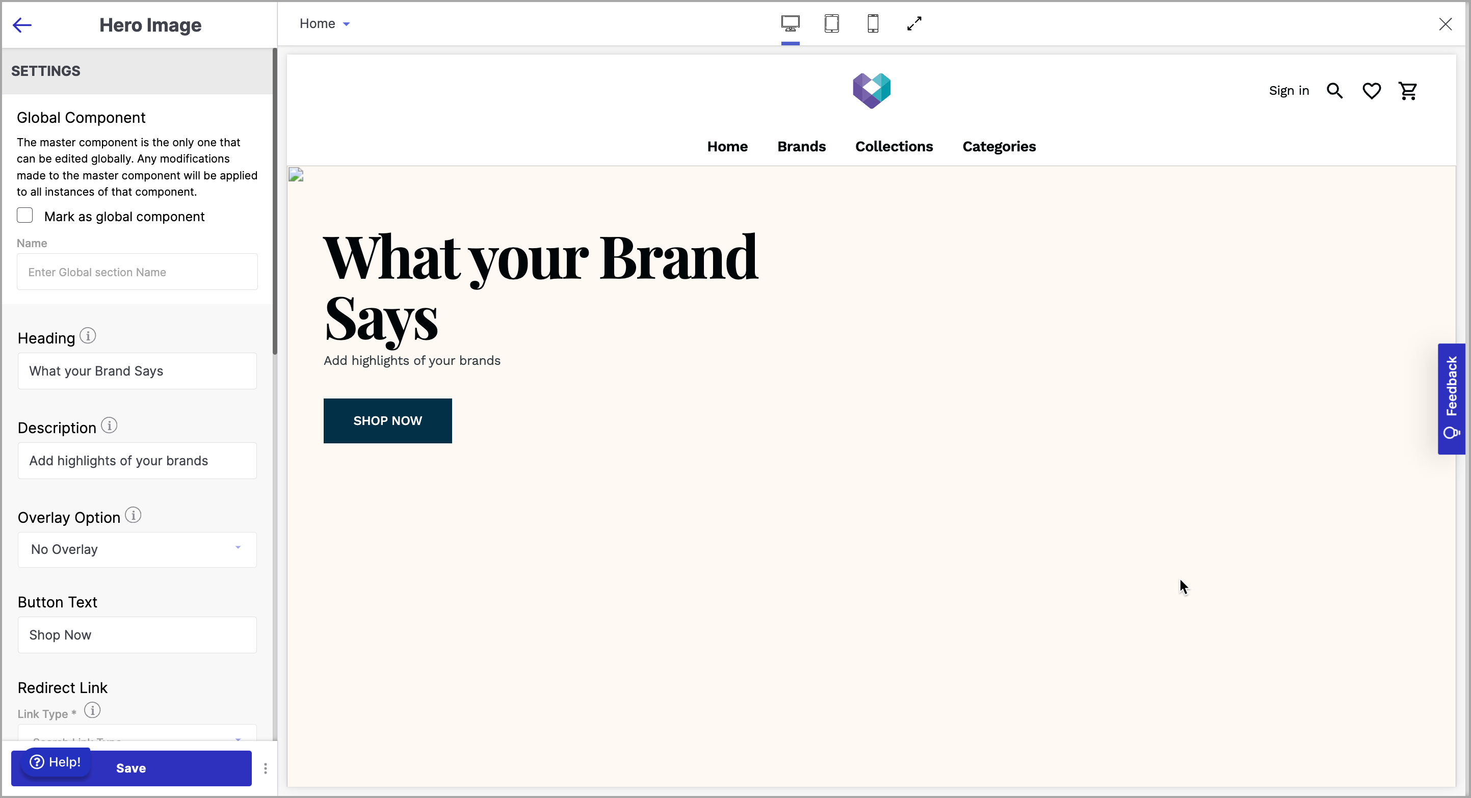
1. Global Component
Marking a section as a Global Component enables universal editing. Any modifications to the master component automatically apply to all instances, ensuring consistency and simplifying updates across the project. Check the box to designate the section as a global component, and you can provide a name for the section.
2. Heading
The Heading of a Hero Image is a text element that is typically placed on top of the image in the Hero section of a website's Home page. It is a short and catchy text element that conveys the website's main message or value proposition to visitors.
3. Description
The Description of a Hero Image is a text element that is typically placed below the Heading in the Hero section of a website's Home page. It usually consists of a short paragraph that provides additional information about the website's main offering, product, or service.
4. Overlay Option
The Overlay Option of a Hero Image is a design feature that allows website designers to add a semi-transparent layer of black or white colour on top of the image in the Hero section of a website's Home page.
5. Button Text
The Button Text of a Hero Image is a text element that is typically placed on the Hero section of a website's Home page, usually below the Description text. The purpose of the Button Text is to provide a clear call to action that prompts the visitor to take the desired action. Some examples of button text are “Learn More” “Buy Now” “Get Started” etc.
6. Redirect Link
Redirect Link refers to a hyperlink that is attached to the Button Text. When a website visitor clicks on the Button Text, they will be redirected to a specific webpage or URL attached to it.
7. Invert Button Colour
The "Invert Button Colour" toggle button is a feature that allows you to toggle the colour of the button. When the button is toggled on, hovering over the button will invert the colour of the button. This feature is useful for users who have difficulty reading text on certain background colours, as it allows them to easily switch between different colour schemes.
8. Desktop Banner
A desktop banner is a graphic or visual advertisement that appears on a computer screen in a fixed position, typically at the top or bottom of the screen.
To upload a desktop banner on the website.
- Click ‘pen icon’ to upload image.
- Choose drag & drop, computer upload or URL.
- Desktop hero image aspect ratio is 16:9 (1440x810).
- Acceptable formats: png, jpeg, svg+xml, gif.
- Max file size: 2 MB.
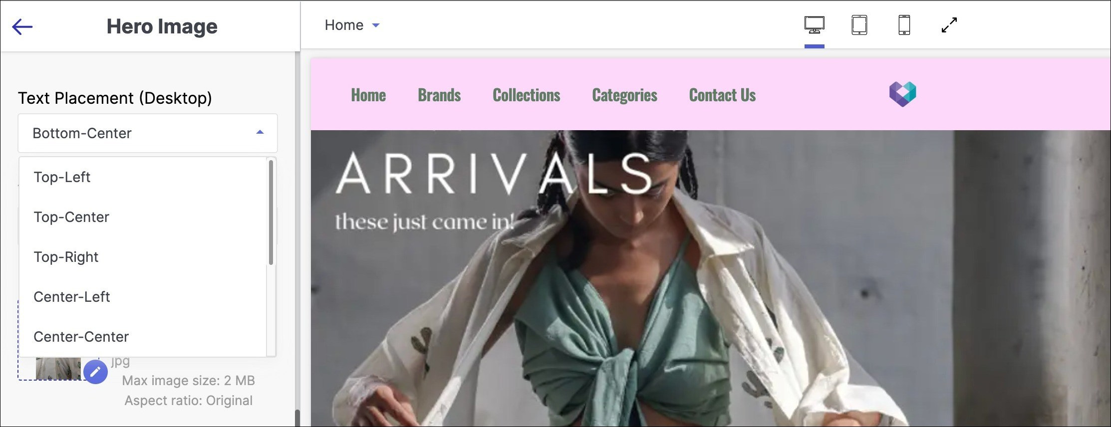
Text Placement (Desktop): Text placement for desktop refers to the strategic positioning of written content on a website that is specifically designed to be viewed on a computer screen.
Below are the steps to configure text placement for desktop:
- Click on the dropdown menu.
- Choose from various positions to place the text:
- Top center
- Top left
- Top right
- Center left
- Center center
- Center right
- Bottom left
- Bottom center
- Bottom right
Text Alignment (Desktop): Text alignment for desktop refers to the placement of text on a computer screen in relation to the left or right margin, or centered within a block of text.
Below are the steps to configure text placement for desktop:
- Centre alignment
- Left alignment
- Right alignment
9. Mobile Banner
A mobile banner is a type of advertisement displayed on mobile devices, typically in the form of a rectangular or square graphic that appears within a mobile app or website.
To upload a desktop banner on the mobile/tablet.
- Click ‘pen icon’ to upload image.
- Choose drag & drop, mobile/tablet upload or URL.
- Mobile hero image aspect ratio is 9:16 (320x569).
- Acceptable formats: png, jpeg, svg+xml, gif.
- Max file size: 2 MB.
Text Placement (Mobile/Tablet): Text placement for mobile/tablet refers to the strategic placement of written content, such as headlines, body copy, and calls-to-action, on a mobile device/tablet screen.
Below are the steps to configure text placement for mobile/desktop:
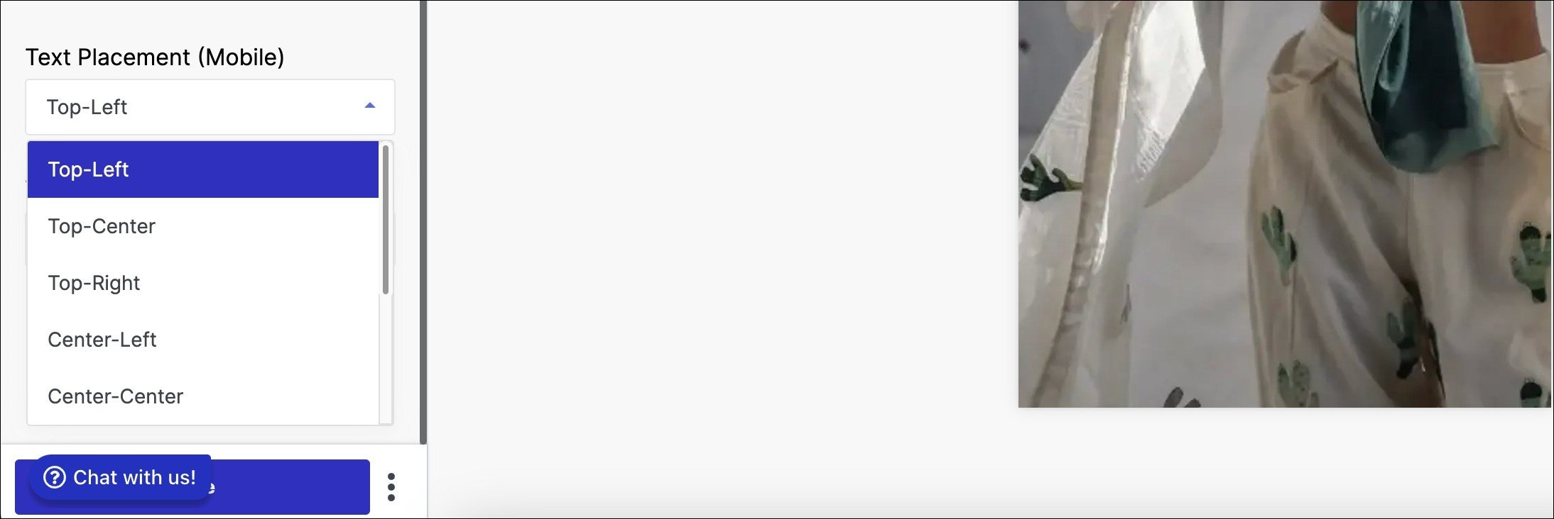
- Click on the dropdown menu.
- Choose from various text placement positions, including:
- Top centre
- Top left
- Top right (tablet only)
- Centre left (tablet only)
- Centre centre
- Centre right (tablet only)
- Bottom left (tablet only)
- Bottom centre
- Bottom right (tablet only)
Text Alignment (Mobile/Tablet): Text alignment for mobile/tablet refers to the positioning of text within a mobile/tablet interface, such as an app or website, in relation to the screen's edges or other elements. [ Insert full image ]
Below are the steps to configure text placement for desktop:
- Centre alignment
- Left alignment
- Right alignment
Tool tip:
Button text - Call to action on a website's Home page. Some options might not be applicable for Mobile.
Featured Collection
A featured collection is a website section that highlights a selection of products, often used in e-commerce. It includes images, descriptions, and pricing information to grab users' attention and encourage exploration, driving sales and engagement.
To add a featured collection section to your website:
- Go to the appearance section of your theme and select 'Edit'.
- Click on 'Add Section' below the list of other sections on the left side of the screen.
- Select 'Featured Collection' from the left sidebar.
Below are the configurable options of the featured collection section:
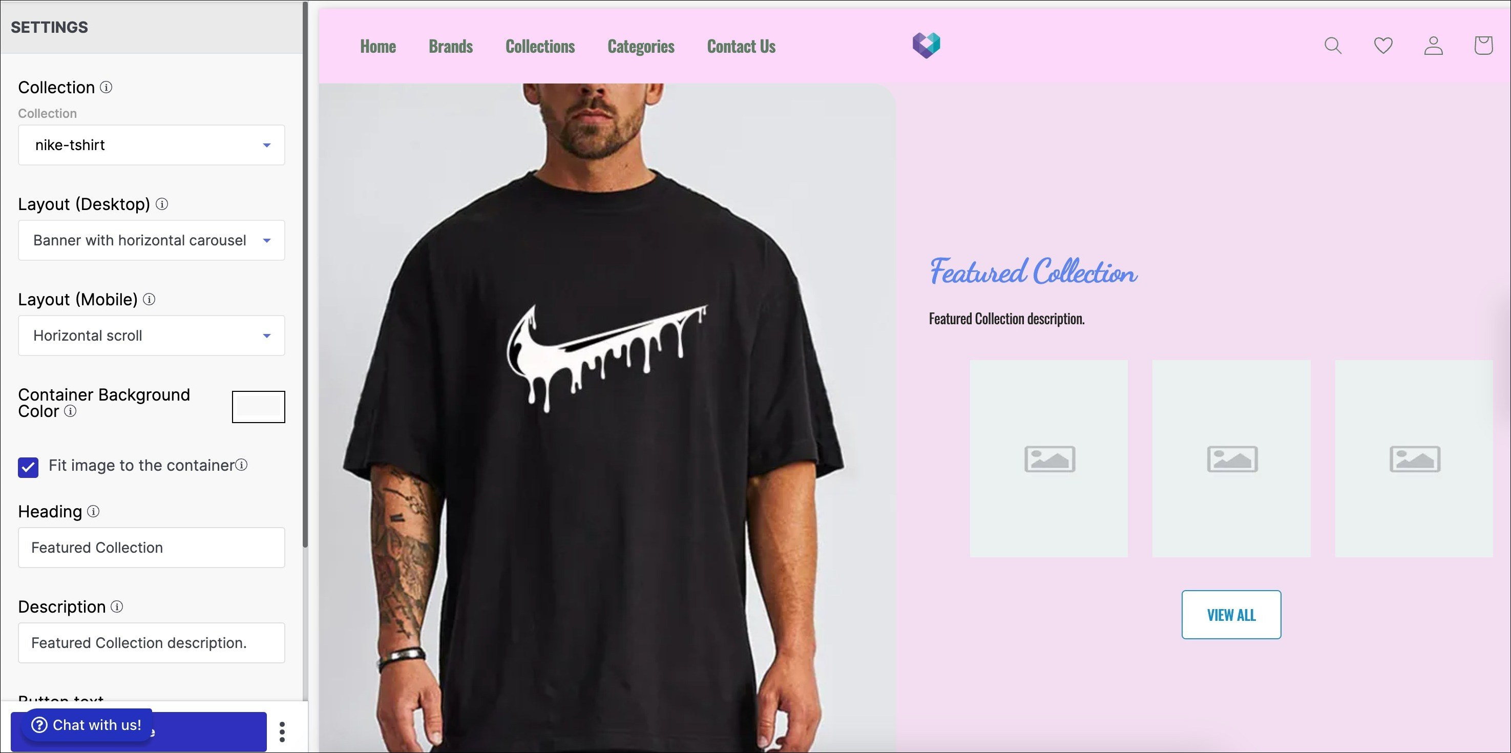
1. Collection
A collection category in a website refers to a group or set of products, services, or content that share a common theme or characteristic. It helps users navigate and locate relevant information quickly and easily.
Steps to configure collection category as a featured collection:
- Search for the collection category from the dropdown menu and select it.
- To create a new collection category, choose 'Create test' and follow the instructions on the admin page.
- To change or delete a collection category, select it and choose 'Change' or 'Delete' from the dropdown menu.
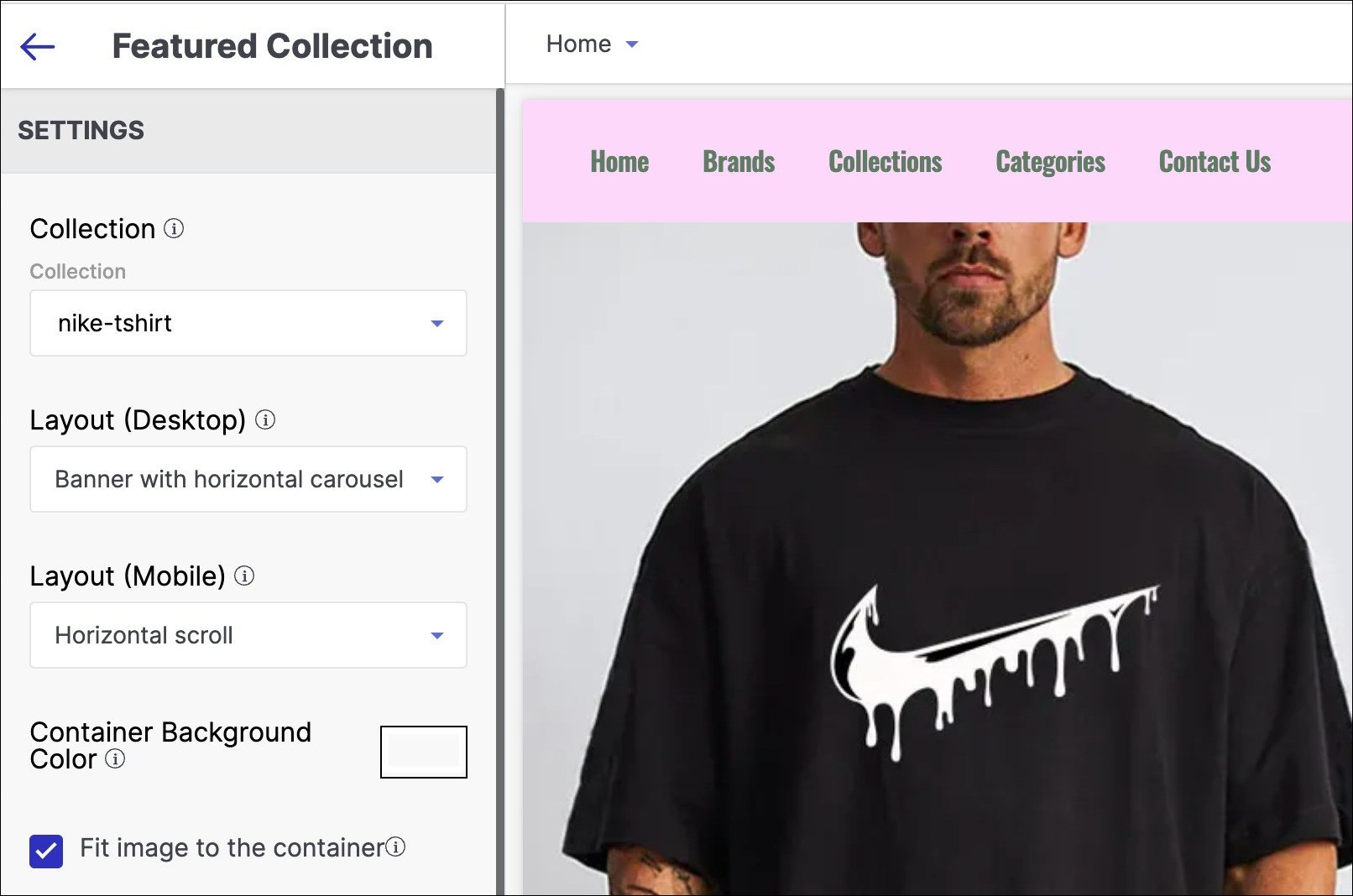
2. Layout (Desktop)
The layout for desktop refers to how a website's elements are visually arranged for larger computer screens to create a cohesive and user-friendly experience.
Steps to configure Layout (Desktop) in your featured collection:
- To select the alignment of content, go to Layout dropdown.
- Choose from 'Horizontal scroll', 'Stacked', or 'Banner with horizontal carousel'.
- Horizontal scroll will show product items in a horizontal scrolling list.
- Stacked view offers a simplified interface for arranging items in a column or row.
- Banner with horizontal carousel displays several product items prominently on the homepage.
3. Layout (Mobile)
Layout for mobile refers to the arrangement and organisation of visual elements, such as text, images, and buttons, within the screen of a mobile device.
Steps to configure Layout (Mobile) in your featured collection:
- Select alignment of content from Layout dropdown.
- Choose from four options:
- Horizontal scroll
- Stacked
- Banner with horizontal scroll
- Banner with stacked
- Horizontal scroll: products appear in horizontal scrolling list.
- Stacked: products appear in simplified interface arranged in column or row.
- Banner with horizontal scroll: multiple product items scroll horizontally for prominent homepage display.
- Banner with stacked: products appear in long and horizontal stacked manner.
Aspect ratio refers to the proportional relationship between the width and height of an image or video. The recommended aspect ratio for images on desktop, tablet, and mobile devices is 4:5. The corresponding pixel dimensions are 437x547 for desktop and 288x360 for mobile. The aspect ratio for tablet remains the same at 4:5.
4. Container Background Colour
Container Background Colour refers to the colour that is applied to the background of a container element in a website or application. Use this option to modify the container background colour of the featured collection section of your store.
5. Fit image to the container
"Fit image to the container" is a term used in web design and development that refers to the process of adjusting an image's size and dimensions to fit within its designated container element on a webpage. Check the Fit image to the container tick-box if you want the aspect of the image to fit in alignment with the container.
Tool tip: A maximum of four products can be displayed in a stacked view (mobile).
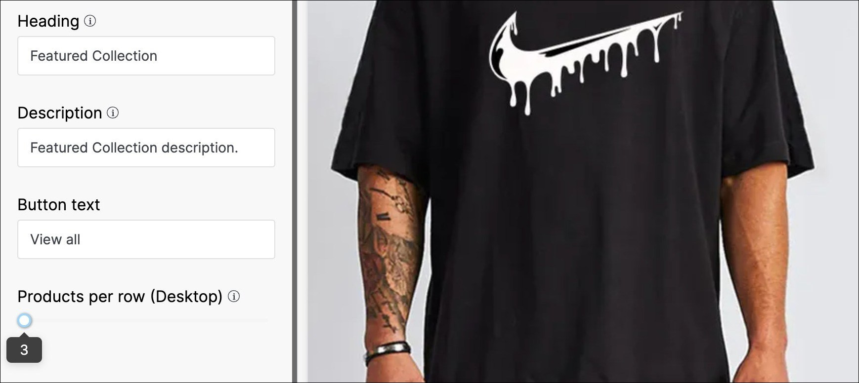
6. Heading
In a featured collection, a heading typically refers to a title or headline that introduces and summarizes the content of the collection. In the title text field, enter the title to be displayed as the primary heading of your Featured Collection.
7. Description
A description in a featured collection is a brief summary or explanation of the theme or purpose of the collection. Enter a brief description of the product items that appear in the Featured Collection section of your store.
8. Button Text
Button text in a featured collection refers to the text displayed on a clickable button that is typically placed below the collection's title or description. Enter the title you want to put in your button text, to enable the user to allow users to tap once to look at options after entering a string and make a decision. Your button text could be named as “View more’, ‘View all’, or “Explore’.
9. Products per row (Desktop)
Products per row (Desktop) in a featured collection refers to the number of products that are displayed in a single row on a desktop screen in a particular section of a website. Using the slider number line, select the number of product items you want to keep in a single row of each collection category. The minimum and maximum numbers of goods product items are 3 and 5, respectively.
Tool tip:
Button text - Call to action on a website's Home page.
Application Banner
An application banner is a common feature on a website's home page, and it serves as a way to communicate important information to visitors. This banner typically appears at the top of the page and displays a message that the website owner wants to convey.
The message can be related to a variety of things, such as a new product release, a limited-time offer, or a site-wide sale. The purpose of the application banner is to draw attention to this message and encourage visitors to take action based on it.
To add an application banner section to your website:
- Go to the appearance section of your theme and select 'Edit'.
- Click on 'Add Section' below the list of other sections on the left side of the screen.
- Select 'Application Banner' from the left sidebar.
Below are the configurable options of the application banner section:
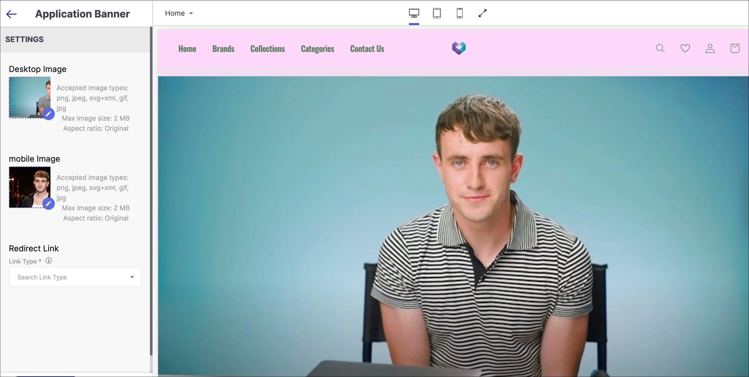
1. Desktop Image
A desktop image in an application banner is the background image displayed behind the logo or title of an application on a desktop computer. It is a visual element that helps to establish the brand identity and create a visually appealing user interface.
Use this option to insert the desktop-compatible image in the application banner. You can upload the image by clicking on the pen.
2. Mobile Image
A mobile image in an application banner refers to the visual content that is displayed on the banner of a mobile application.
Use this option to insert the Mobile-compatible image in the application banner.
- Redirect Link: A redirect link is a web address attached to a text or image that automatically sends a user to a different URL when clicked on the same. To generate a redirect link, follow these steps:
- Click "Link type" in the "Redirect link" section.
- Choose "Custom link" and enter your link, or select a page from the drop-down menu.
- Click the link generated for the app banner to confirm the destination.
- Click "Save" to finalise the redirect link.
Aspect ratio refers to the proportional relationship between the width and height of an image or video. The aspect ratio for desktop is fixed at 19:6 (1440x455) with width fill, while for tablet it adapts to the image with width fill. The aspect ratio for mobile also adapts to the image with width fill, and is fixed at 4:5 (320x400).
Categories Listing
A Categories Listing on a Home page is a section that displays a list of categories related to the content or products offered on the website or application, allowing users to quickly navigate to the specific category they are interested in.
To add a categories listing section to your website:
- Go to the appearance section of your theme and select 'Edit'.
- Click on 'Add Section' below the list of other sections on the left side of the screen.
- Select 'Categories Listing' from the left sidebar.
Below are the configurable options of the categories listing section:
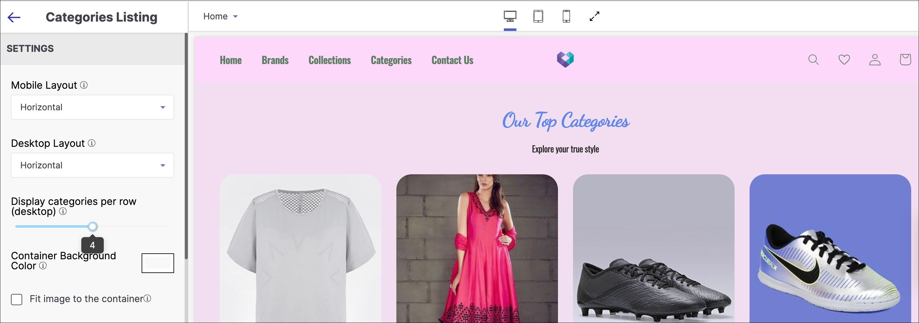
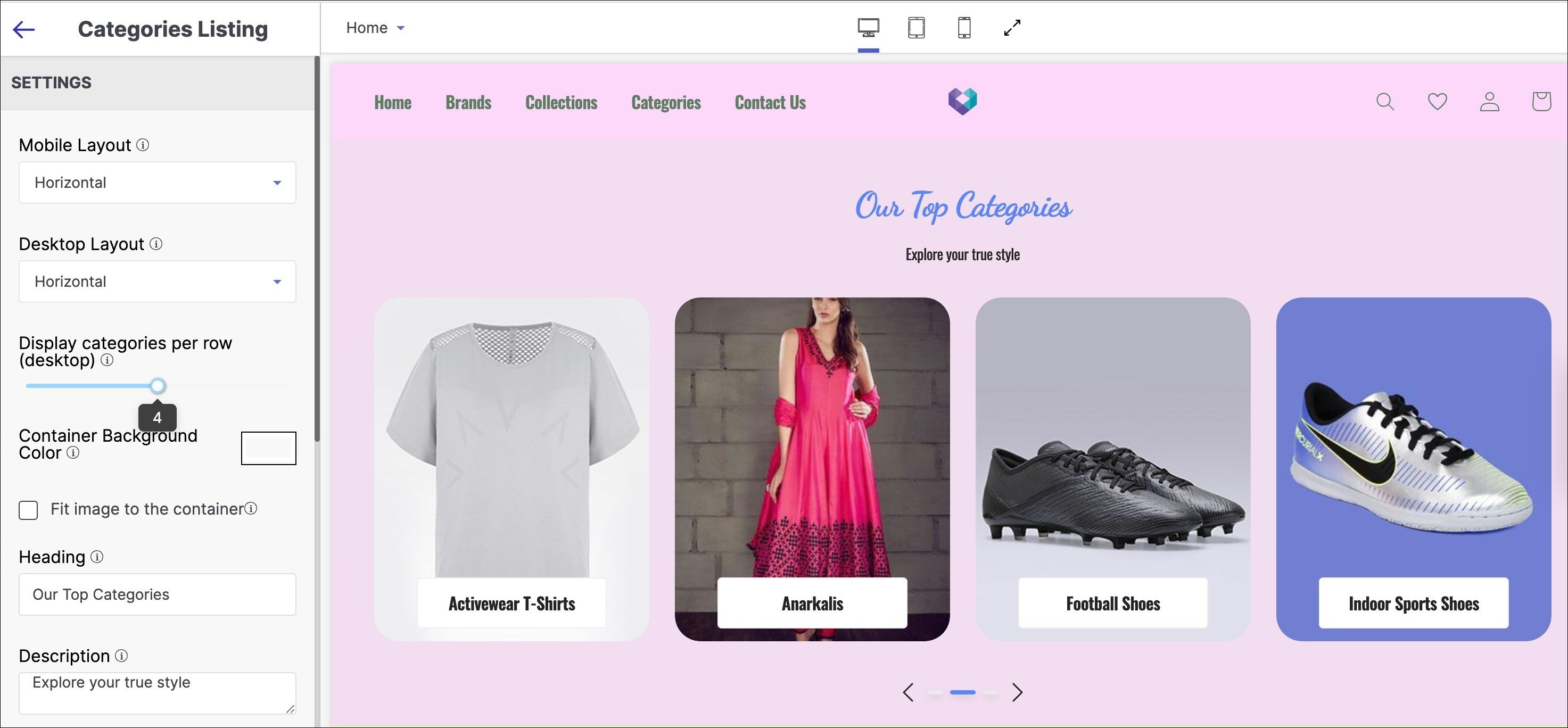
1. Mobile Layout
A mobile layout in categories listing refers to the design and arrangement of categories on a website or app specifically for mobile devices. This ensures that users can easily navigate and find the categories they are looking for on their mobile devices.
Steps to configure Mobile Layout in your categories listing:
- Select alignment of content from Layout dropdown.
- Choose between Stacked or Horizontal alignment.
- Stacked view offers simplified interface for arranging content in a column or row.
- Horizontal scroll presents product items in a horizontal scrolling list.
2. Desktop Layout
Desktop layout in categories listing refers to the arrangement of different categories or folders on a computer desktop. It allows users to easily access and organise their files and applications.
Steps to configure Desktop Layout in your categories listing:
- Select alignment of content from Layout dropdown as 'Stacked' or 'Horizontal'.
- Stacked view offers simplified interface for arranging views in a column or row.
- Horizontal scroll shows product items in a horizontal scrolling list.
Note: Aspect ratio refers to the proportional relationship between the width and height of an image or video. Aspect ratios for images are as follows: 4:5 (437x547) for desktop, 4:5 for tablet, and 4:5 (138x172) for mobile.
3. Display categories per row (desktop)
Display categories per row (desktop) in categories listing refers to the number of category columns that are displayed in a single row on a desktop device.
Using the slider number line, select the number of collections you want to keep in a single row of each collections listing category. The minimum and maximum numbers of goods product items are 3 and 5, respectively.
4. Container Background colour
Container Background colour refers to the colour that is applied to the background of a container element in a website or application. Use this option to modify the container background colour of the categories listing section of your store.
5. Fit image to the container
"Fit image to the container" is a term used in web design and development that refers to the process of adjusting an image's size and dimensions to fit within its designated container element on a webpage. Check the Fit image to the container tick-box if you want the aspect of the image to fit in alignment with the container.
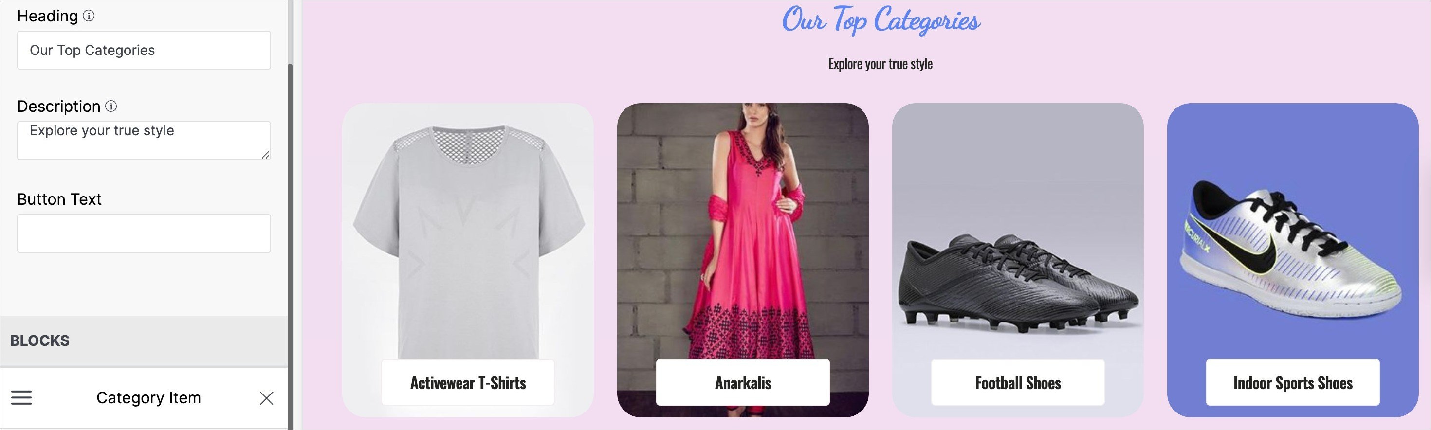
6. Heading
A heading in categories listing is a title or label given to a group of related categories in order to organize and simplify the navigation of a website or application. In the title text field, enter the title to be displayed as the primary heading of your Categories Listing section.
7. Description
Description in categories listing refers to the text or brief summary that describes a particular category of products or services on a website or app. It is typically displayed alongside the category name and image, and it provides users with a better understanding of what they can expect to find within that category.
Enter a brief description of the product items that appear in the Categories Listing section of your store.
8. Button text
Button text in categories listing refers to the text that appears on a button that is associated with a specific category. This button is often used to allow users to easily select or filter content based on the chosen category.
Enter the title you want to put in your button text, to enable the user to allow users to tap once to look at options after entering a string and make a decision. Your button text could be named as ‘Grab this offer’, or “Hurry now’.
9. Blocks
Blocks in categories listing refer to the visual or graphical elements that are used to display and organise categories of content. These blocks typically contain an image or icon that represents the category, as well as a title or label that describes it.
Below are the steps to configure blocks in categories listing:
- Click "Add block" below the BLOCKS section in the left sidebar of your theme.
- Choose a category item or add another category block from the search brand dropdown menu.
- Select Department:
- Choose or add the desired department category from the dropdown in the "Select department" option.
- Add the department category as another block to your theme.
Tool tip:
Button text - Call to action on a website's Home page.
BLOCKS - Add category item blocks to the section.
Collections Listing
A Collection Listing on a Home page is a section that displays a curated collection of products or content related to a specific theme or category, allowing users to easily browse and discover new items.
To add a collections listing section to your website:
- Go to the appearance section of your theme and select 'Edit'.
- Click on 'Add Section' below the list of other sections on the left side of the screen.
- Select 'Collections Listing' from the left sidebar.
Below are the configurable options of the collections listing section:
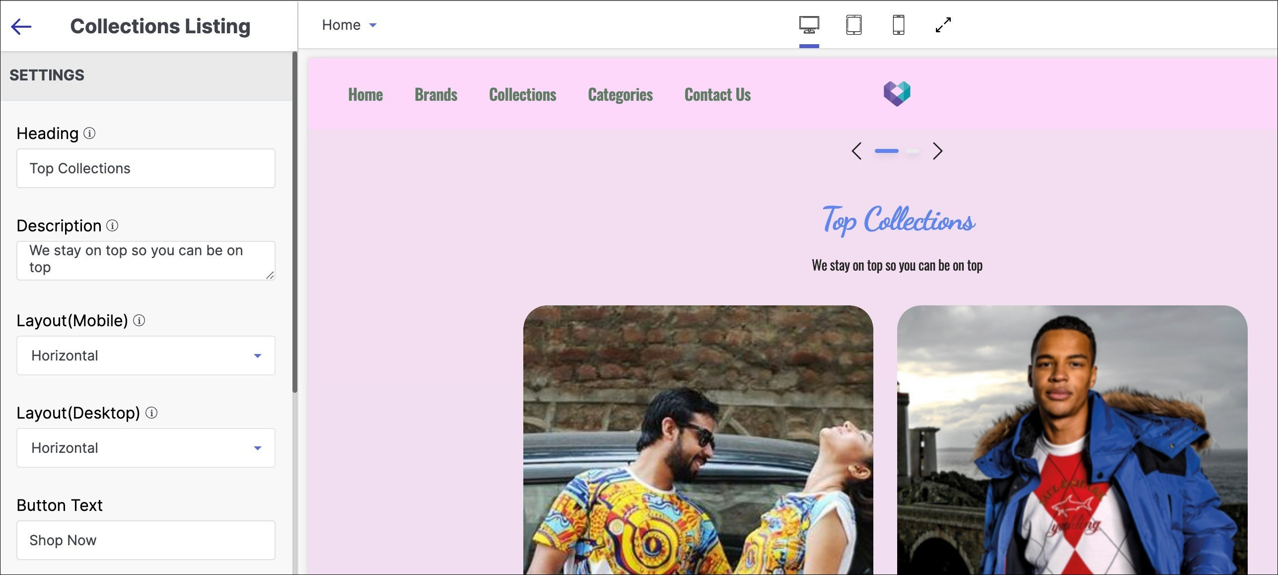
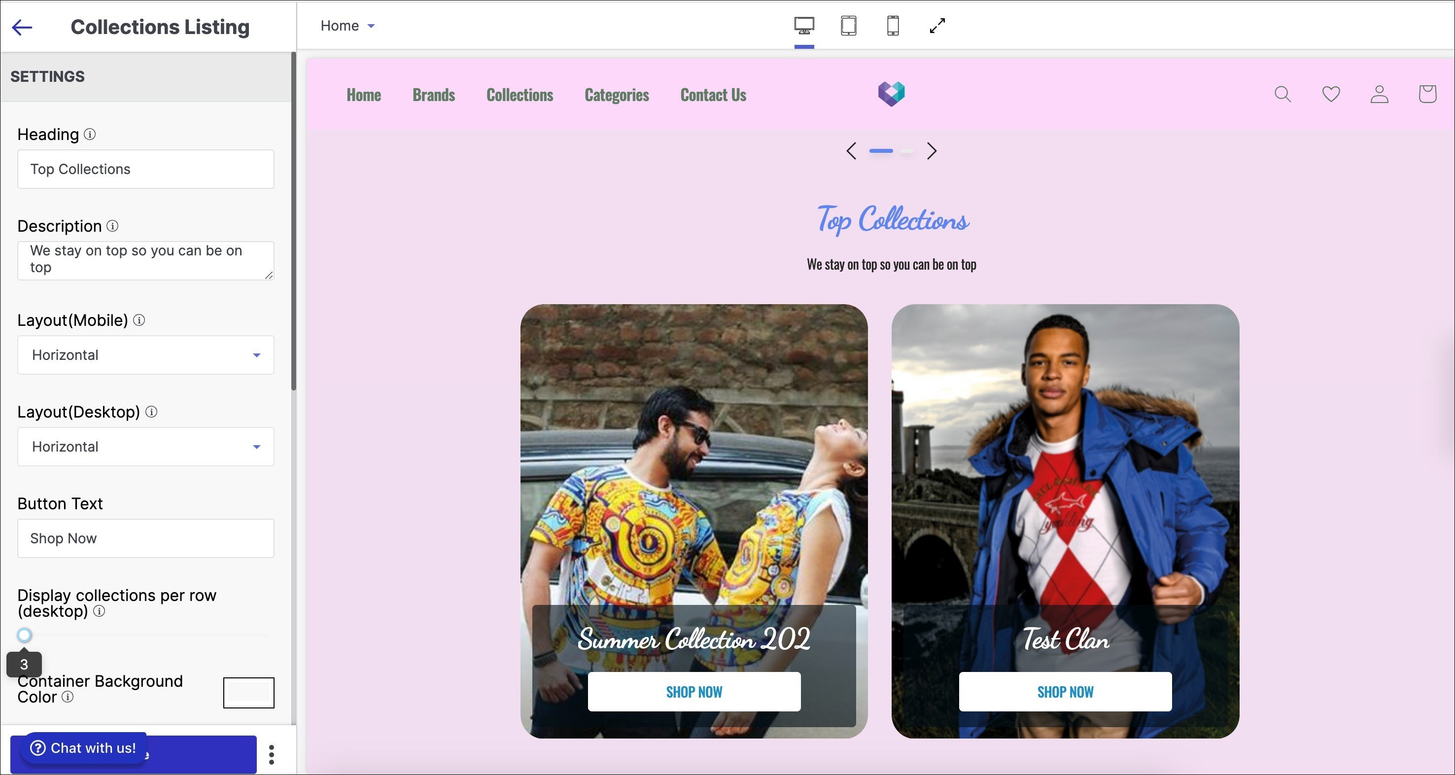
1. Heading
Heading in collections listing refers to the main title or label that is used to categorise and group similar products or items together in a collection. In the title text field, enter the title to be displayed as the primary heading of your Collections Listing section.
2. Description
Description in collections listing refers to a brief summary or explanation of a collection of items or products. It is typically displayed on a page alongside the collection's title and may include information such as the theme or purpose of the collection, the types of products included, and any special features or benefits of the collection.
Enter a brief description of the product items that appear in the Collections Listing section of your store.
3. Layout (Mobile)
Layout (Mobile) in collections listing refers to the way in which products are displayed on a mobile device. It determines the arrangement of product images, titles, prices, and other relevant information to provide the best possible user experience for mobile users.
Steps to configure Layout (Mobile) in your collections listing:
- Select alignment of content as 'Stacked' or 'Horizontal' from Layout dropdown.
- Stacked view: product items appear in a column or row for simplified interface.
- Horizontal scroll: product items appear in a horizontal scrolling list.
4. Layout (Desktop)
Layout (Desktop) in collections listing refers to the arrangement and organisation of collection items in a grid or list format on a desktop computer screen.
Steps to configure Layout (Desktop) in your collections listing:
- Select alignment of content as 'Grid' or 'Horizontal' from Layout dropdown.
- Grid view displays product items in a 2D scrolling grid.
- Horizontal scroll displays product items in a horizontal scrolling list.
5. Button Text
Button text in collections listing refers to the text that appears on the button or link associated with each collection in an e-commerce store's collection page.
Enter the title you want to put in your button text, to enable the user to allow users to tap once to look at options after entering a string and make a decision. Your button text could be named as ‘Shop now, or “Buy now’.
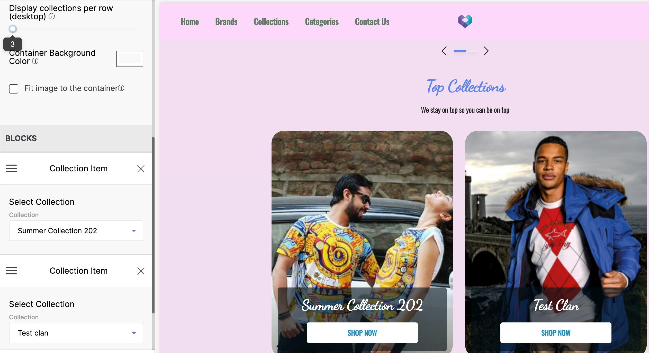
6. Display collections per row (desktop)
Display collections per row (desktop) in collections listing refers to the number of collection items or groupings of products that are displayed in a single row on a desktop or larger screen.
Using the slider number line, select the number of collections you want to keep in a single row of each collections listing category. The minimum and maximum numbers of goods product items are 3 and 4, respectively.
7. Container Background colour
Container Background colour refers to the colour that is applied to the background of a container element in a website or application. Use this option to modify the container background colour of the collections listing section of your store.
8. Fit image to the container
"Fit image to the container" is a term used in web design and development that refers to the process of adjusting an image's size and dimensions to fit within its designated container element on a webpage. Check the Fit image to the container tick-box if you want the aspect of the image to fit in alignment with the container.
9. Blocks
Blocks in collections listing refer to the sections or groupings of products within a collection. It allows for the organisation and categorization of products within a collection based on various attributes such as colour, size, or style.
Below are the steps to configure blocks in collections listing:
- Click on "Add block" button below "BLOCKS" section in left sidebar,
- Choose a collection item or add a collection block from search brand dropdown menu.
Image Slideshow
An Image Slideshow is a section on a website that displays a series of images or slides that automatically transition to capture the user's attention and encourage further exploration of the website.
To add a image slideshow section to your website:
- Go to the appearance section of your theme and select 'Edit'.
- Click on 'Add Section' below the list of other sections on the left side of the screen.
- Select 'Image Slideshow' from the left sidebar.
Below are the configurable options of the image slideshow section:
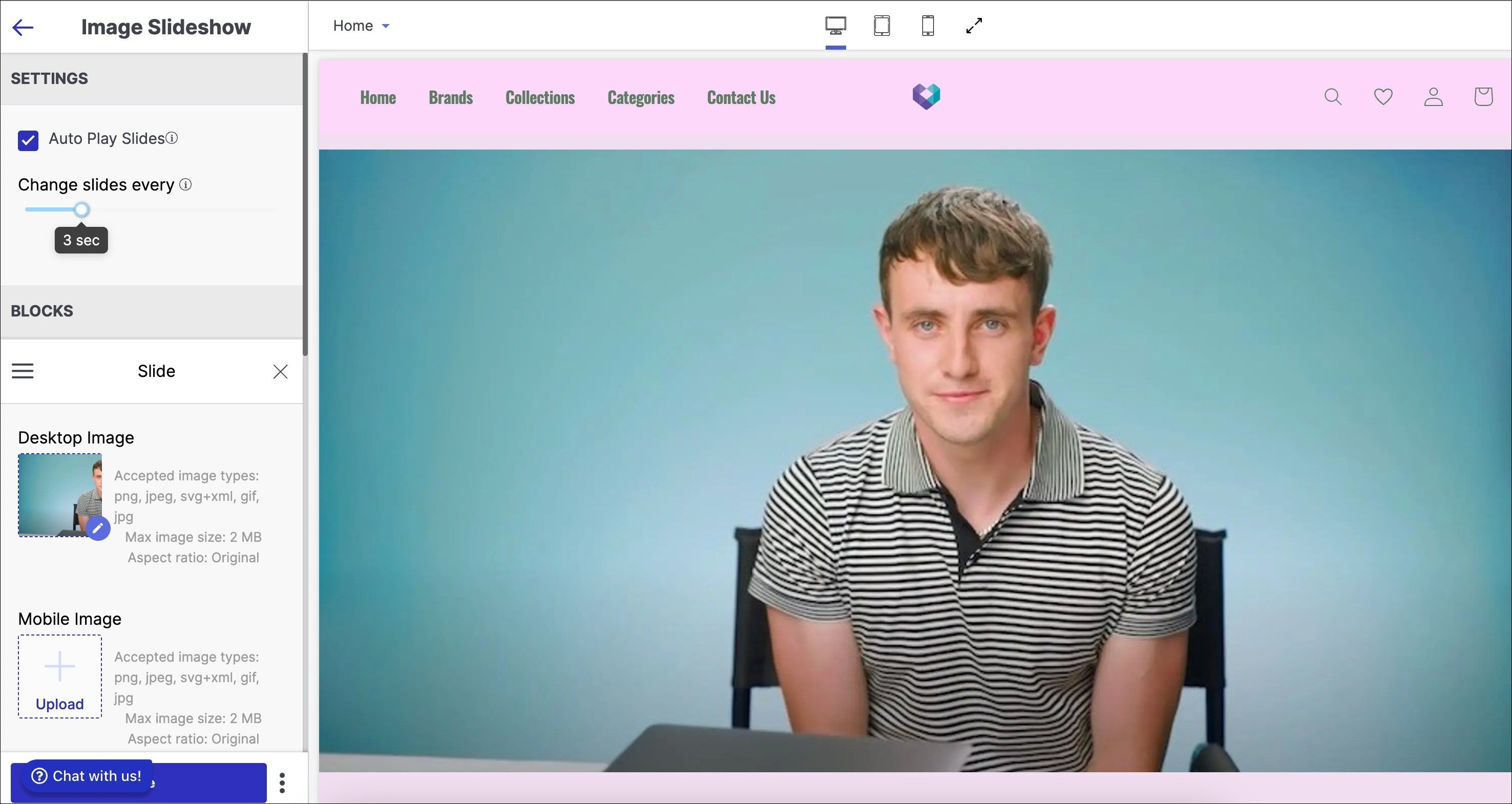
1. Auto Play Slides
Auto play slides in an image slideshow refer to the automatic transition of images in the slideshow without requiring user input. Use this option to allow a slideshow to start playing automatically, without the need for manual control.
2. Change slides every
"Change slides every" in an image slideshow refers to the time duration between each transition of slides in the slideshow. It determines how long one slide will be displayed before the slideshow automatically switches to the next slide. Use this option that allows you to set the time duration for automatic slide transitions.
Aspect ratio refers to the proportional relationship between the width and height of an image or video. Image aspect ratio is maintained for all devices - desktop (16:5), tablet, and mobile (3:4). Scroll indicators are placed based on the height of the tallest image for consistent display.
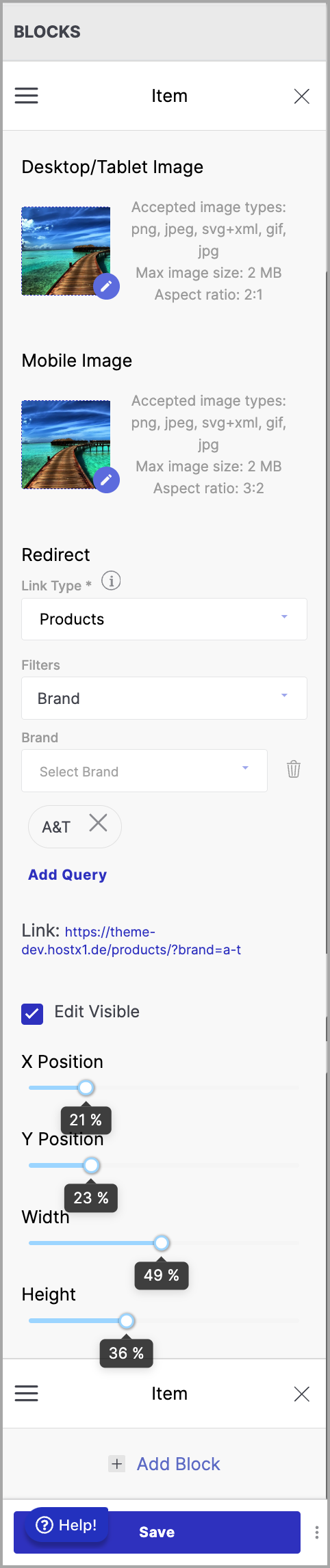
3. Blocks
In an image slideshow, blocks refer to the individual units or sections that contain the images being displayed. Each block typically contains one image, and the slideshow transitions between these blocks to create a dynamic visual display.
Below are the steps to configure blocks in categories listing:
- Click "Add Block"
- Choose an option to add an image:
- Desktop Image: Upload image for desktop site.
- Mobile Image: Upload image for mobile site.
- Slide Link: Add web address to image for redirection.
- Filters: Select filter for image.
- Edit Visible: Reposition an image using the XY scale and adjust its size by specifying the desired height and width.
Tool tip:
BLOCKS - Add image blocks for slideshow of the section.
Brands Listing
Brand Listing on a website is a section that displays logos, names and perhaps products of different brands that are associated with the website or the products and services offered on the website. It's often used to showcase the website's partnerships, collaborations, or authorised reseller status.
To add brands listing section to your website:
- Go to the appearance section of your theme and select 'Edit'.
- Click on 'Add Section' below the list of other sections on the left side of the screen.
- Select 'Brands Listing' from the left sidebar.
Below are the configurable options of the brands listing section:
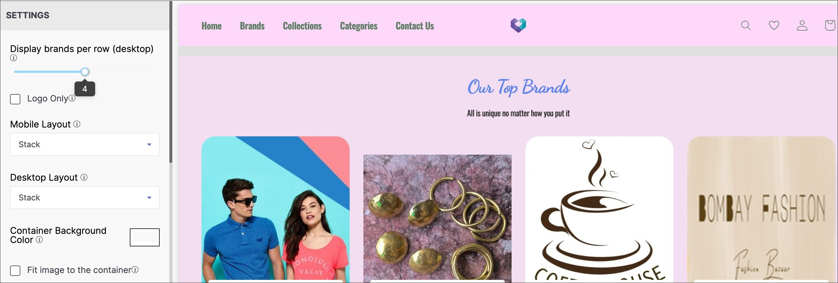
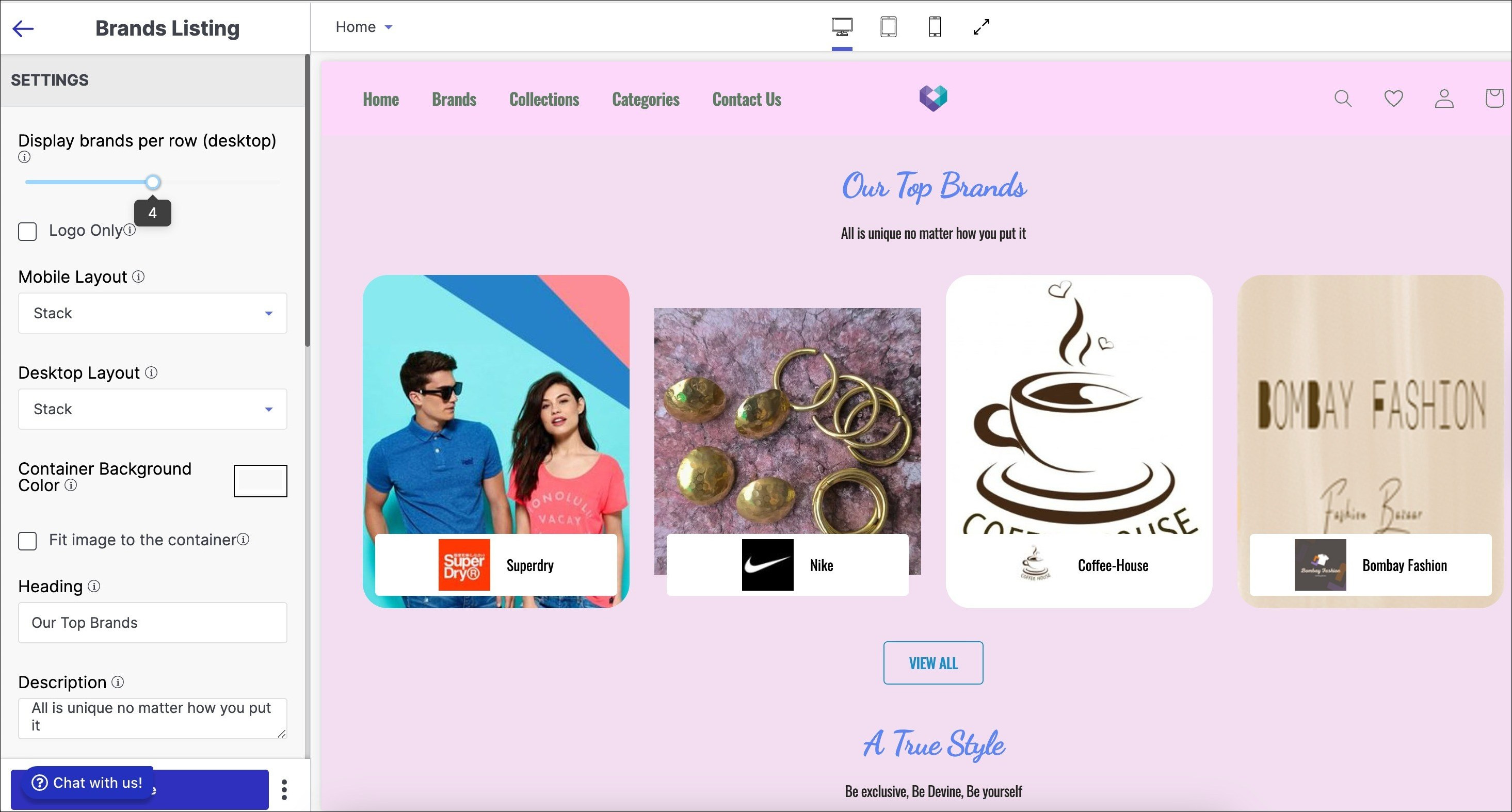
1. Display brands per row (desktop)
"Display brands per row (desktop) in brands listing" refers to the number of brand logos or images that are displayed in a single row on a desktop screen when browsing a list of brands.
Using the slider number line, select the number of brands you want to keep in a single row of each brands listing category. The minimum and maximum numbers of goods product items are 3 and 5, respectively.
2. Logo Only
A logo-only listing in a brands listing refers to a display of only the logo of a brand, without any accompanying text or information. Tick the Logo Only checkbox if you want to display the logo of the brands in your Brands Listing section.
Aspect ratio refers to the proportional relationship between the width and height of an image or video. The aspect ratio for brand logos changes with devices. On desktop, it's 1:1 and 200x200 pixels, for tablets, it's also 1:1, and for mobile devices, it's 1:1 and 90x90 pixels.
3. Layout (Mobile)
Layout (Mobile) in brands listing refers to the arrangement and design of the brand logos or names on the mobile version of a website or application. It determines how the brands are visually displayed to the user, including factors such as size, spacing, and alignment.
Steps to configure Layout (Mobile) in your brands listing:
- Select alignment from Layout dropdown: Stacked or Horizontal.
- Stacked view: product items in column or row for simplified interface.
- Horizontal scroll: product items in scrolling list horizontally.
4. Layout (Desktop)
In a brands listing, the Layout (Desktop) refers to the way in which the brand logos or names are displayed on a desktop or laptop screen. It may include the arrangement, spacing, size, and order of the logos/names, as well as any visual or design elements that are used to highlight or differentiate the brands.
Steps to configure Layout (Desktop) in your brands listing:
- Select 'Stacked' or 'Horizontal' alignment from Layout dropdown.
- 'Stacked' view offers a simplified interface for arranging content in a column or row.
- 'Horizontal' scroll shows product items in a horizontal scrolling list.
Aspect ratio refers to the proportional relationship between the width and height of an image or video. The recommended aspect ratio for an application banner image is 4:5, with image sizes of 437x547 pixels for desktop and 288x360 pixels for mobile and tablet devices.
5. Container Background Colour
Container Background colour refers to the colour that is applied to the background of a container element in a website or application. Use this option to modify the container background colour of the featured collection section of your store.
6. Fit image to the container
"Fit image to the container" is a term used in web design and development that refers to the process of adjusting an image's size and dimensions to fit within its designated container element on a webpage. Check the Fit image to the container tick-box if you want the aspect of the image to fit in alignment with the container.
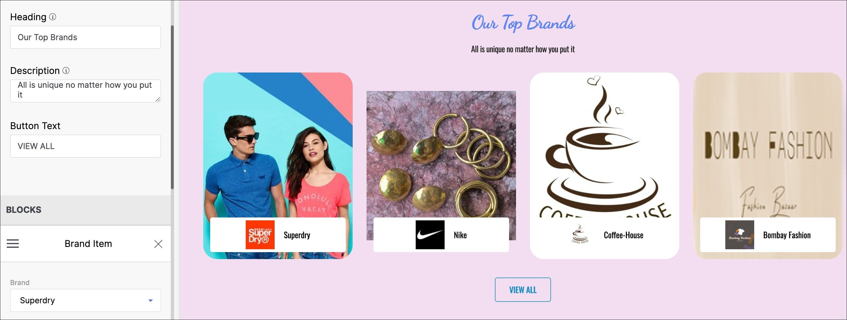
7. Heading
The Heading of a brands listing is a text element that is typically placed on top of the image in the brands listing of a website's Home page. It is a short and catchy text element that conveys the website's main message or value proposition to visitors.
8. Description
The Description of a brands listing is a text element that is typically placed below the Heading in the brands listing of a website's Home page. It usually consists of a short paragraph that provides additional information about the website's main offering, product, or service.
9. Button Text
Button text in brands listing refers to the text displayed on the button that allows users to interact with a particular brand within the listing.
Enter the title you want to put in your button text, to enable the user to allow users to tap once to look at options after entering a string and make a decision. Your button text could be named as ‘View all brands’, or “Explore more brands’.
10. Blocks
In the context of brand listings, blocks refer to sections or areas where different brands are displayed together. These blocks can be categorised based on different criteria, such as product type, brand popularity, or price range.
To add a block to your theme, click on the ‘Add block’ button right below the BLOCKS section in the left sidebar. Then, from the search brand dropdown menu, choose a brand item or add another block.
Tool tip:
Button text - Call to action on a website's Home page.
BLOCKS - Add brand item blocks to the section
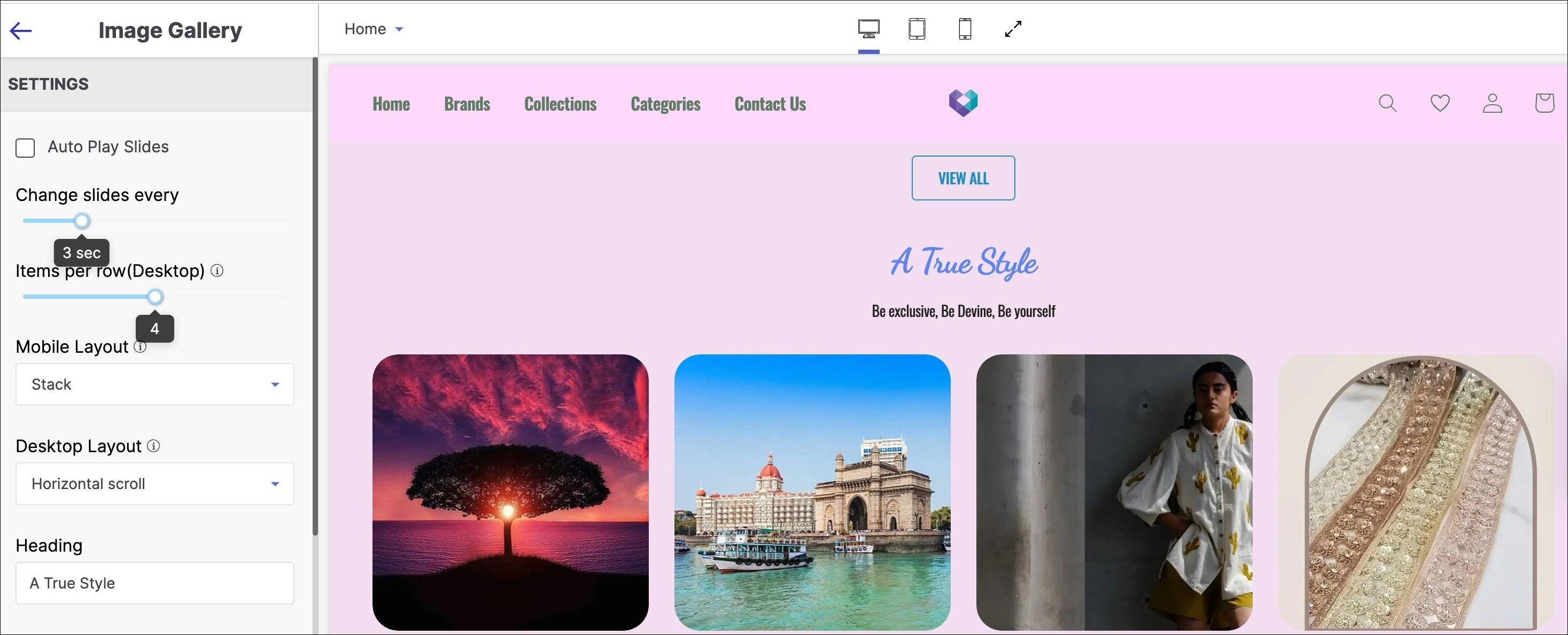
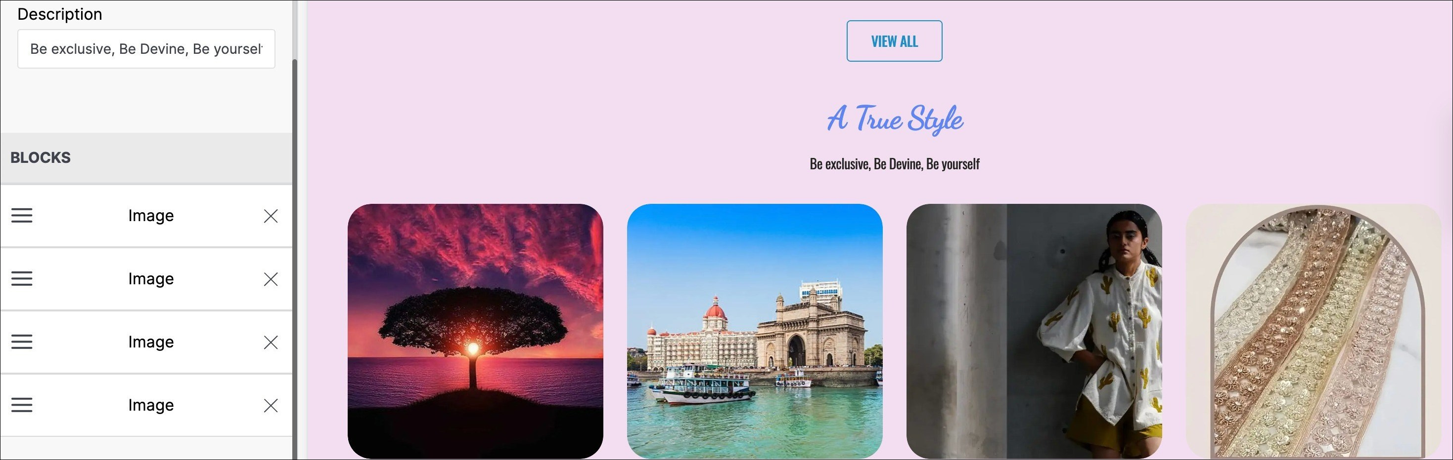
Image Gallery
An image gallery in a website is a collection of images organised in a visually appealing and structured manner. It is usually created to showcase a specific set of images, such as photographs, graphics, or artwork, to the website's visitors.

To add image gallery section to your website:
- Go to the appearance section of your theme and select 'Edit'.
- Click on 'Add Section' below the list of other sections on the left side of the screen.
- Select 'Image Gallery' from the left sidebar.
Below are the configurable options of the image gallery section:
1. AutoPlay Slides
Auto play slides in an image gallery refers to the automatic transition of images in the slideshow without requiring user input. Use this option to allow a slideshow to start playing automatically, without the need for manual control.
2. Change slides every
"Change slides every" in an image gallery refers to the time duration between each transition of slides in the slideshow. It determines how long one slide will be displayed before the slideshow automatically switches to the next slide. Use this option that allows you to set the time duration for automatic slide transitions.
3. Items per row (Desktop)
Items per row (Desktop) in an image gallery refers to the number of images that are displayed horizontally in a single row on a desktop screen. The minimum and maximum numbers of goods product items are 3 and 5, respectively.
4. Mobile Layout
A mobile layout in an image gallery section of a website refers to the design and arrangement of images that are optimised for display on smaller screens such as those of smartphones and tablets.
Mobile website layouts provides two configurations:
- Stacked: Content is arranged vertically for a linear display, ideal for text-heavy content like articles or product listings.
- Horizontal Scroll: Content is arranged horizontally, allowing users to scroll left and right to view the content, ideal for visual content like images or graphs.
5. Desktop Layout
A desktop layout in an image gallery section of a website refers to the design and arrangement of images on the gallery page when viewed on a desktop or laptop computer.
Desktop website layouts provides two configurations:
- Stacked: Content is arranged vertically for a linear display, ideal for text-heavy content like articles or product listings.
- Horizontal Scroll: Content is arranged horizontally, allowing users to scroll left and right to view the content, ideal for visual content like images or graphs.
6. Heading
In an image gallery, a heading typically refers to a title or headline that introduces and summaries the content of the gallery. In the title text field, enter the title to be displayed as the primary heading of your image gallery.
7. Description
A description in an image gallery is a brief summary or explanation of the purpose of the image gallery. Enter a brief description of the product items that appear in the image gallery section of your store.
8. Blocks
In an image gallery, a block refers to a square or rectangular area where an image or a group of images are displayed. These blocks can vary in size and are typically arranged in a grid-like pattern.
To add a block to your Image gallery section:
- To add an image block, click "Add block" below the "BLOCKS" section in the left sidebar.
- Choose "Image" from the search brand dropdown menu.
- Upload an image for your category listing using the given specifications:
- Accepted image types: png, jpeg, svg+xml, gif, jpg
- Max image size: 2 MB
- Aspect ratio: Original
Aspect ratio refers to the proportional relationship between the width and height of an image or video. Aspect ratio varies by device. Desktop and tablet aspect ratios are both 1:1, while mobile has an aspect ratio of 1:1 at 138x138 pixels.
Hero Video
A hero video on a website is a large, visually striking video that is prominently featured on the homepage or landing page. It is designed to capture the viewer's attention and create a strong first impression of the website or brand.
To add hero video section to your website:
- Go to the appearance section of your theme and select 'Edit'.
- Click on 'Add Section' below the list of other sections on the left side of the screen.
- Select 'Hero Video' from the left sidebar.
Below are the configurable options of the hero video section:
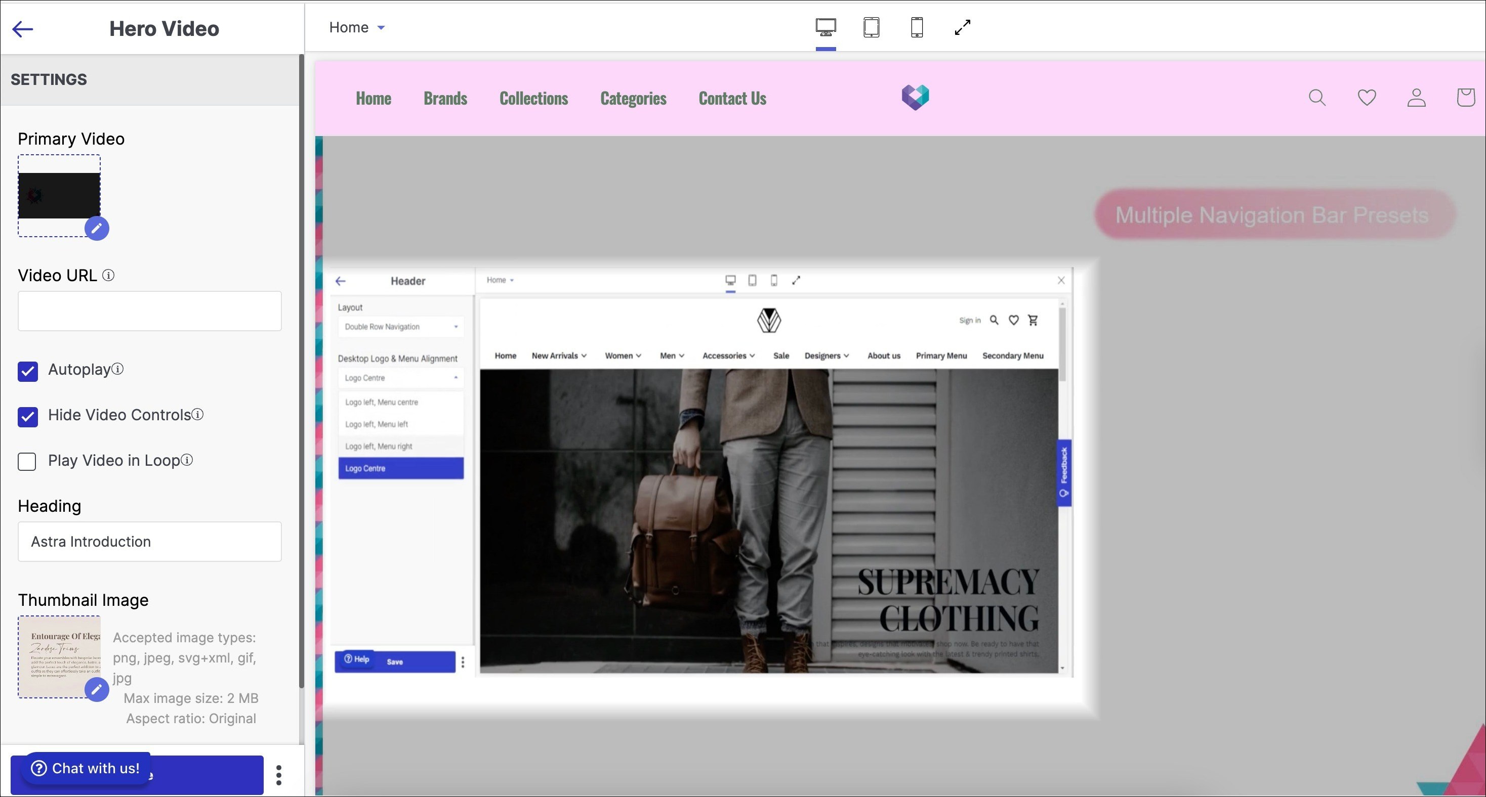
1. Primary Video
The primary video in the hero video section of a website refers to the main video that is displayed prominently at the top of the website's homepage or landing page.
Steps to configure Primary Video in your hero video:
- Click the pen icon.
- The upload screen will appear.
- Three methods for uploading the hero video: drag and drop, computer upload, or URL.
- Hero video dimensions: height 810px, width 1440px, format MP4.
- Select the video by clicking on it after upload.
Aspect ratio refers to the proportional relationship between the width and height of an image or video. The aspect ratio for the application banner varies for different devices. For desktop, it is 16:9 with a resolution of 1440x810. For tablets, it is also 16:9, and for mobile devices, it is 16:9 with a resolution of 320x180.
2. Video URL
A video URL in the hero video section of a website is the web address of a video that is used as the main visual element or background of the website's homepage or landing page.
Below are the configurations of Video URL:
3. Autoplay
Auto-play is a feature that automatically starts playing a video when the page is loaded, without requiring the user to click a play button. Check to turn it on.
4. Hide Video Control
Enabling this feature will hide the play/pause button on the hero video.
5. Play Video In loop
This feature enables the video to play repeatedly, without ending.
6. Heading
In the hero video, a heading typically refers to a title or headline that introduces and summarises the content of the video. In the title text field, enter the title to be displayed as the primary heading of your hero video.
7. Thumbnail Image
A thumbnail image in the hero video section of a website refers to a small image that is used to represent the video content. Use the upload button in the left side bar to upload the thumbnail image of your hero video.
Tool tip:
BLOCKS - Add hyperlinked images to the section.
Testimonial
The Testimonial section on a website displays feedback from previous customers to build trust and encourage potential customers to take action. This document outlines how to establish the Testimonials component of your store. Employ the section to present a textbox with reviews of your store's products and offerings from users, partners, and employees.
To add a testimonial section to your website:
- Go to the appearance section of your theme and select 'Edit'.
- Click on 'Add Section' below the list of other sections on the left side of the screen.
- Select 'Testimonial' from the left sidebar.
Below are the configurable options of the testimonial section:
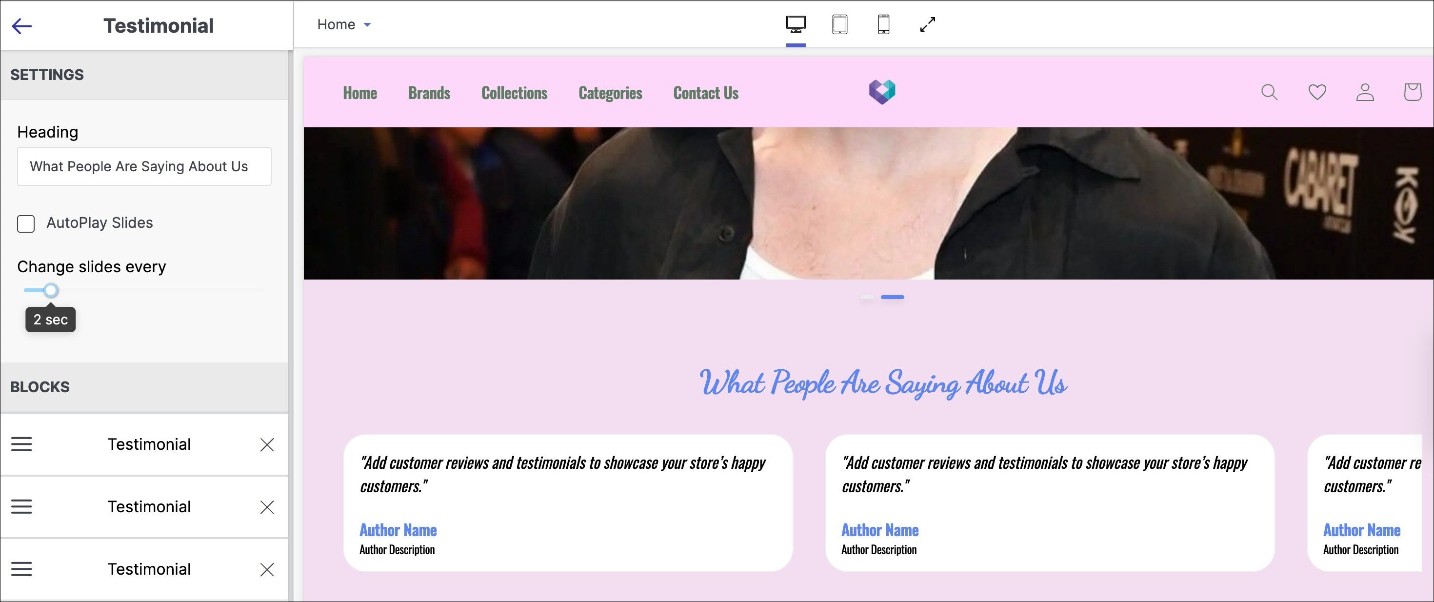
1. Heading
In a testimonial section, a heading typically refers to a title or headline that introduces and summarises the content of the testimonial section. In the title text field, enter the title to be displayed as the primary heading of your testimonial section.
2. AutoPlay Slides
Auto play slides in a testimonial section refer to the automatic transition of images in the slideshow without requiring user input. Check the AutoPlay slides tick-box if you want to display automatic advance to the next slide in your Testimonials section.
3. Change slides every
"Change slides every" in a testimonial section refers to the time duration between each transition of slides in the slideshow. It determines how long one slide will be displayed before the slideshow automatically switches to the next slide. Use this option that allows you to set the time duration for automatic slide transitions. The number of seconds range from 1 second to 10 seconds.
4. Blocks
Blocks in the testimonial section of a website refer to the individual sections or units that display each testimonial.
Below are the steps to configure blocks in testimonial:
- Click 'Add block' below the BLOCKS section in the sidebar.
- Select 'Testimonial' from the search brand dropdown menu.
- Fill in the details including an image.
- Accepted image types: png, jpeg, svg+xml, gif.
- Max image size: 2 MB.
Note: Aspect ratio refers to the proportional relationship between the width and height of an image or video. The aspect ratio for the image is 1:1 across all devices. For desktop, the recommended image size is 232x232 pixels. For tablet and mobile, the recommended size is 300x300 pixels.
Author Name: Author name in the testimonial section of a website refers to the name of the person who provided the testimonial. Add the name of the author who has written the testimonial.
Author Description: An author description in the testimonial section of a website is a brief statement that provides context about the person who provided the testimonial. Write a brief description about the author.
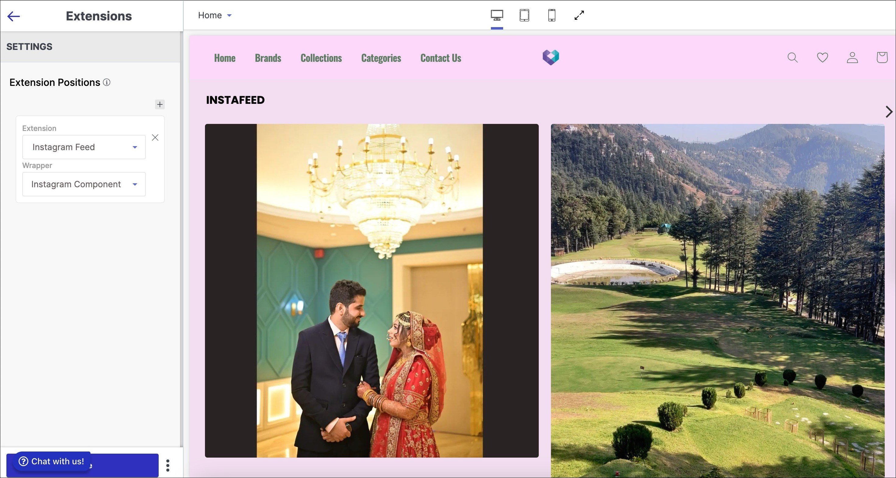
Extensions
The Extension section is typically a dedicated area where website owners can display icons or links to their social media profiles, such as Facebook, Twitter, Instagram, or LinkedIn. Its aim is to prompt visitors to connect with the business on social media or follow their updates.
To add a extensions section to your website:
- Go to the appearance section of your theme and select 'Edit'.
- Click on 'Add Section' below the list of other sections on the left side of the screen.
- Select 'Extensions' from the left sidebar.
Below are the configurable options of the extensions section:
1. Extension Positions
The extension positions in the extension section of a website refer to the specific locations or areas on a web page where browser extensions or add-ons can be displayed or integrated.
Below are the steps to configure extension positions:
- Click on the ‘+’ button to add an extension.
- Add extension (e.g. WhatsApp Order Notification).
- Wrapper (e.g. WhatsApp consent).
- Users can add many other extensions using the same procedure.