Colour Palette
A colour palette is a set of colours used consistently in a website's design to create a specific mood or tone. It includes primary and secondary colours as well as accent colours.
A well-designed colour palette unifies a website's elements and enhances its visual appeal, reinforcing its brand identity. colour choices are made based on factors such as the target audience, industry, and intended use of the website.
The colour Palette represents a set of standardized colours provided for use. However, each theme may interpret and utilize the palette in its own unique way.
How to access the Colour Palette?
Here is the navigation to access the colour Palette:
Sections > Settings > General
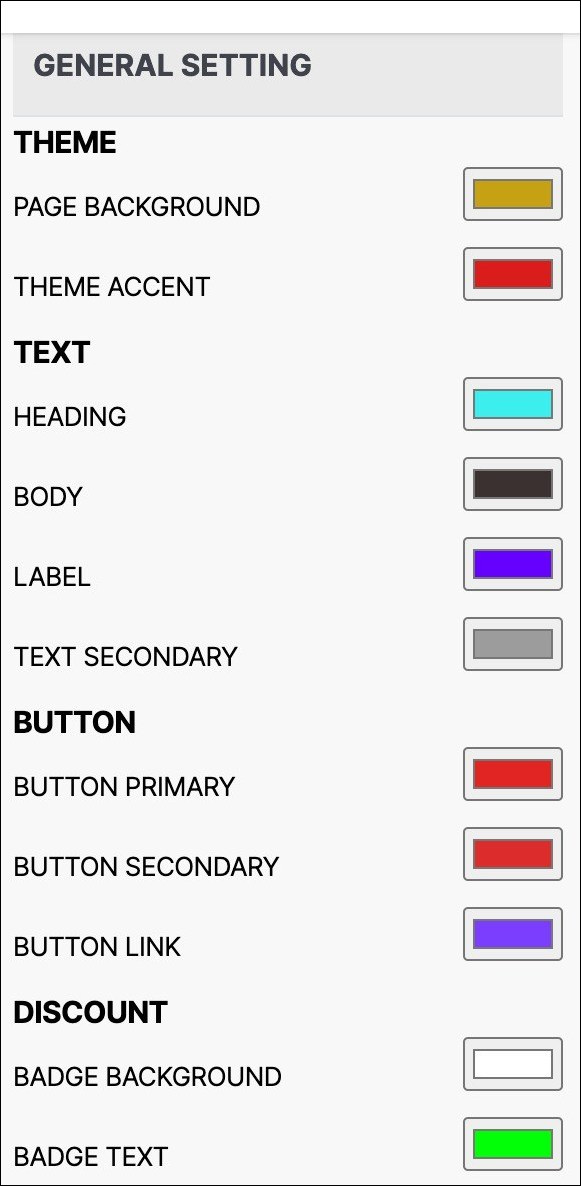
Please find below the available colours in the colour Palette, organized by section.
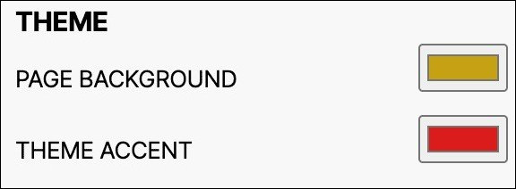
THEME
- PAGE BACKGROUND: Adjust the colour of your e-commerce site's background, including the main area.
- THEME ACCENT: Customize accent colour to highlight key elements like hero menu sub-menu or product listing page description.
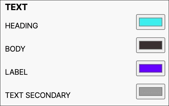
TEXT
The colours used are mainly black shades and text colours fall into four categories:
- HEADING: Main headings and titles on a web page.
- BODY: Main text content on a website, including paragraphs and lists.
- LABEL: Text used for labeling fields and product details on an e-commerce website.
- TEXT SECONDARY: colour of text that appears on inactive buttons, links, or fields.
Each option allows for customization of the respective text colour across the entire webpage.
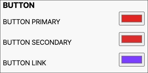
BUTTON
End users only need to modify three button colours: Primary, Secondary, and Link. These colours are assigned in the following ways:
- BUTTON PRIMARY: This is the primary colour used for important website actions, such as checkout and view more buttons.
- BUTTON SECONDARY: This colour is for non-primary actions such as "Add to Cart", "Cancel" and can be customized site-wide.
- BUTTON LINK: A standalone text with no background to navigate online content.
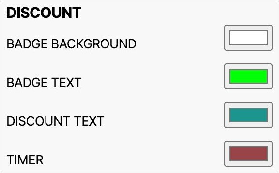
DISCOUNT
End users can change two button colours - Primary colour and Secondary colour. These colours are assigned as follows:
- BADGE BACKGROUND: Refers to colour for product price before discount, customizable for the entire webpage.
- BADGE TEXT: Refers to the badge text colour in the sales section of the website, customizable site-wide.
- DISCOUNT TEXT: Refers to discount percentage colour, customizable site-wide.
- TIMER: Timers measure specific time intervals, displaying a countdown clock until an offer expires.
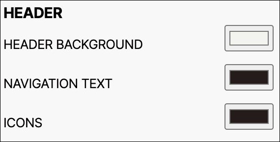
HEADER
- HEADER BACKGROUND: Customize site-wide header background colour, including logo and navigation menu.
- NAVIGATION TEXT: Header text colour on an e-commerce site can be customized site-wide.
- ICONS: Header icons can have a universal colour scheme throughout the e-commerce site.
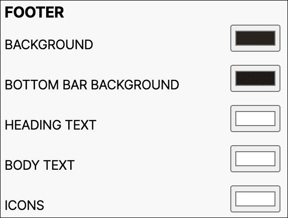
FOOTER
- BACKGROUND: Customize the background colour behind the footer section of your e-commerce website across the entire webpage.
- BOTTOM BAR BACKGROUND: Change footer's bottom bar colour for whole website.
- HEADING TEXT: Customize the colour of the title text in the footer section of your e-commerce website across the entire webpage.
- BODY TEXT: Customize the colour of the body text in the footer section of your e-commerce website across the entire webpage.
- ICONS: Customize footer icons' colour for e-commerce website.
Here is the navigation to access the advanced settings of the colour Palette:
Sections > General > Advance Setting
Please find below the available colours in the advanced setting of the colour Palette, organized by section.
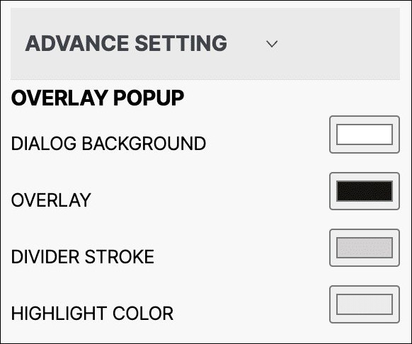
OVERLAY POPUP
Overlay_colour are used with alpha value (Opacity) of 60%. Pop-up_bg_colours are usually equal or lighter to the background colour of the website.
- DIALOG BACKGROUND
- OVERLAY
- DIVIDER STROKE
- HIGHLIGHT COLOUR
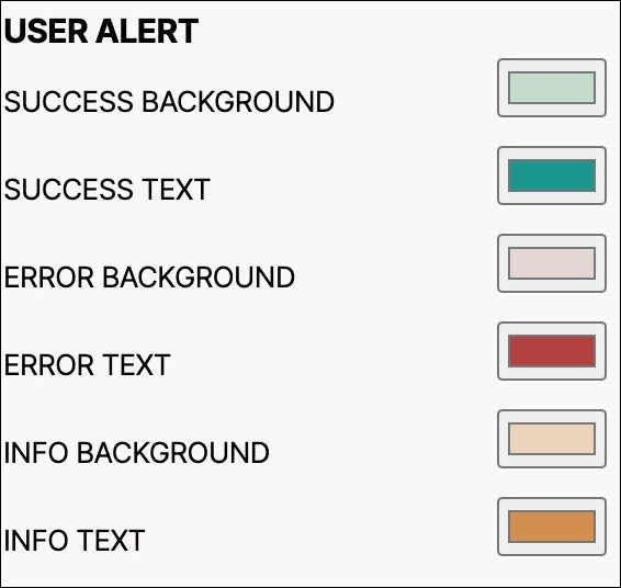
USER ALERT
- SUCCESS BACKGROUND
- SUCCESS TEXT
- ERROR BACKGROUND
- ERROR TEXT
- INFO BACKGROUND
- INFO TEXT
Introducing New colour Palette
Updated on March 31, 2023
We are excited to announce the release of our new colour Palette configuration for Sales Channel Websites. With this new configuration, you can easily customize your website's appearance.
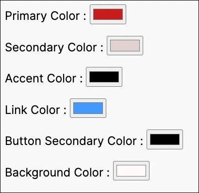
The previous colour palette was limited to only six colours, which restricted the user experience.Introducing our new colour Palette configuration for Sales Channel Websites. Customize your site's appearance with ease.
The old colour palette consisted of:
- Primary colour
- Secondary colour
- Accent colour
- Link colour
- Button Secondary colour
- Background colour
To enhance the utilisation of colours for the users, we have added more colour options to ensure a consistent design and seamless user experience.
The new colour Palette has replaced Primary, Secondary, Accent, Link, Button Secondary, and Background colours with:
- Button Primary
- Text Heading
- Theme Accent
- Button Link
- Button Secondary
- Page Background
New colour Palette
Mapping
To ensure compatibility with the new colour palette, themes need to be updated.
Every existing theme needs to do relevant changes to accommodate the new colour palette. If the theme is not yet migrated to the new colour Palette Configuration, you can still use the old colour palette.
Previously, if a certain element's colour was controlled by the primary colour variable, in the new template it must be configured using button Primary.
Below is a mapping of all six old colour variables to their corresponding new colour variables:
| Old colour Palette | New colour Palette |
|---|---|
| Primary | BUTTON PRIMARY |
| Secondary | TEXT HEADING |
| accent | THEME ACCENT |
| link | BUTTON LINK |
| button secondary | BUTTON SECONDARY |
| background | PAGE BACKGROUND |