Dashboard
Introduction
The dashboard is a concise overview of the entire e-commerce lifecycle. It shows the exact numbers and figures in real-time, starting from the availability of products till their subsequent delivery.
Dashboard Overview
There are various sections in the dashboard that highlight real-time metrics and charts. It provides sellers with insights into their business performance, primarily focusing on Orders, Inventory, Logistics, and Users.
Filters
Filters panel that enables sellers to refine the data displayed on the dashboard according to various criteria. Here's a detailed explanation of each filter available:
-
Sales Channel Selector: This dropdown allows the seller to choose which sales channel’s data they want to view.
-
Date Range: This shows the selected date range for which the data is being displayed.
-
Frequency Selector (Daily): This dropdown allows the seller to choose the frequency with which data is displayed. In this case, it is set to Daily, meaning the data shown will be divided into daily intervals.
More Filters
-
Location: This filter allows the seller to choose a specific location or region to view data for. Sellers operating in multiple locations or regions may want to analyze performance metrics (such as orders, returns, and cancellations) for a specific location. This helps identify regional trends or issues with specific areas.
-
Category: This filter allows the seller to select specific product categories for data analysis. They can narrow down the data to focus only on specific categories of products.
-
Brand: This filter lets the seller select data based on a specific brand or set of brands. Sellers offer multiple brands in their store may want to analyze the performance of individual brands.
-
Values: This filter helps sellers view data in two ways—total values to get an overview of gross performance, and net values to understand the adjusted performance after customer returns or order cancellations.
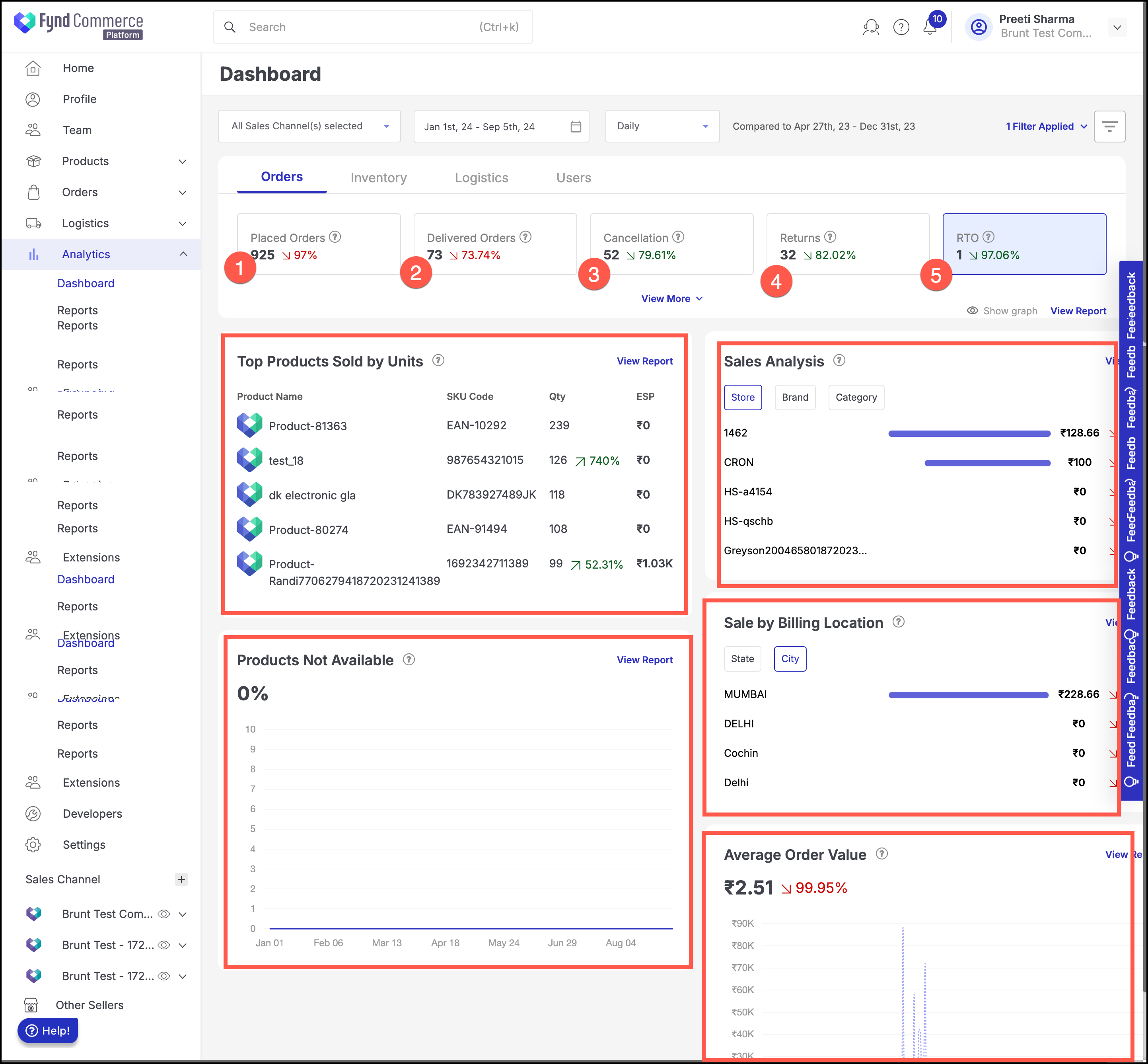
Orders
Under the Orders tab, several key metrics are displayed:
- Placed Orders: The total number of orders placed within the selected date range.
- Delivered Orders: The number of orders successfully delivered that were placed within the selected date range.
- Cancellations: The number of orders cancelled that were placed within the selected date range.
- Returns: The number of orders returned that were placed within the selected date range.
- RTO (Return to Origin): Orders that could not be delivered and were returned to the origin due to delivery issues within the selected date range. Each of these metrics provides crucial information on the seller's order flow and fulfillment.
Top Products Sold By Units
It gives details like Product Name, SKU, and Quantity about products (top 5 selling products) that have been sold with larger quantities within the selected date range. Also, it represents the increase or decrease in percentage of sales for top selling products. For e.g., Shawn Black Formal Shirt has 5 quantities sold and shows 50% increase in sales as compared to previous sales.
Sales Analysis
Sales analysis provides valuable insights into store, brand, and category performance, allowing sellers to make informed decisions regarding inventory management and sales strategies.
Products Not Available
It represents the percentage of products that were not available for orders between the selected date range. These are rejected items by selling location(s) due to out of stock or damaged product issues.
Sales By Billing Location
It represents the distribution of percentage of orders processed for different states and cities to help identify potential growth areas. For e.g., Mumbai location has 68.18% orders processed for the selected date range, whereas Navi Mumbai has 31.82%.
Average Order Value
The Average Order Value is a metric that tracks the average monetary value of orders placed by customers. Specifically, in this context, it refers to the value of delivered orders—orders that have been successfully fulfilled.
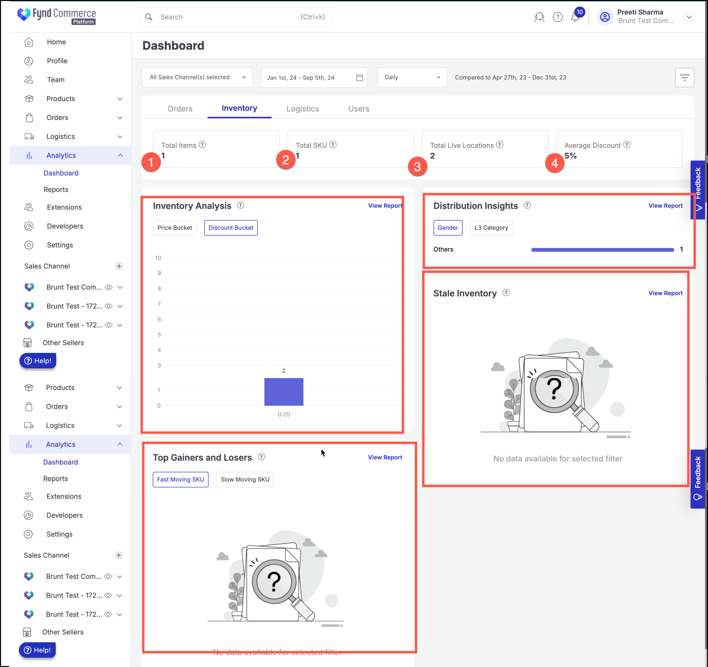
Inventory
This tab provides key insights into inventory performance, distribution trends, and stock movement. Here's a breakdown of each section:
-
Total Items: It shows the total number of items currently in the inventory. This metric gives an overview of the stock available for sale across all categories.
-
Total SKU: It represents the total number of distinct Stock Keeping Units (SKUs) in the inventory. SKUs allow tracking of individual products based on various attributes such as size, color, or model. This metric helps in understanding how many different products or variations are available.
-
Total Live Locations: It displays the total number of live or active locations (stores or warehouses) where the inventory is being managed or sold. Helps in understanding how widely distributed the inventory is across different locations.
-
Average Discount: It shows the average discount applied across all items in the inventory. This metric gives an indication of overall discounting strategies and how they may affect pricing and inventory turnover.
Inventory Analysis
This section provides insights into inventory based on price ranges (Price Bucket) and discount levels (Discount Bucket).
Price Bucket: Helps analyze the inventory based on price segmentation. Sellers can understand how much inventory is concentrated in different price ranges (e.g., low-priced, mid-priced, or premium items). Discount Bucket: Allows sellers to see how much of their inventory is being discounted and at what level. This helps track discount strategies and potential revenue impact.
Distribution Insights
It provides distribution insights based on Gender (product targeting) and L3 Category (third-level product category).
Gender: Shows the distribution of inventory based on gender-specific products (e.g., male, female, unisex).
L3 Category: Helps sellers understand the distribution of inventory by more specific product categories, providing a more granular view of stock.
Stale Inventory
This section identifies products that have remained in the inventory for an extended period without selling (stale inventory). It helps sellers identify products that are not moving and may need attention, such as markdowns, promotions, or being removed from inventory.
Top Gainers and Losers
This section identifies the best and worst-performing SKUs based on sales speed. It helps sellers optimize inventory by focusing on fast-moving items and addressing slow-moving stock through clearance sales or other strategies.
Fast Moving SKU: Shows products that are selling quickly, indicating high demand.
Slow Moving SKU: Highlights products that are not selling as expected, which could require action such as promotions or stock reductions.
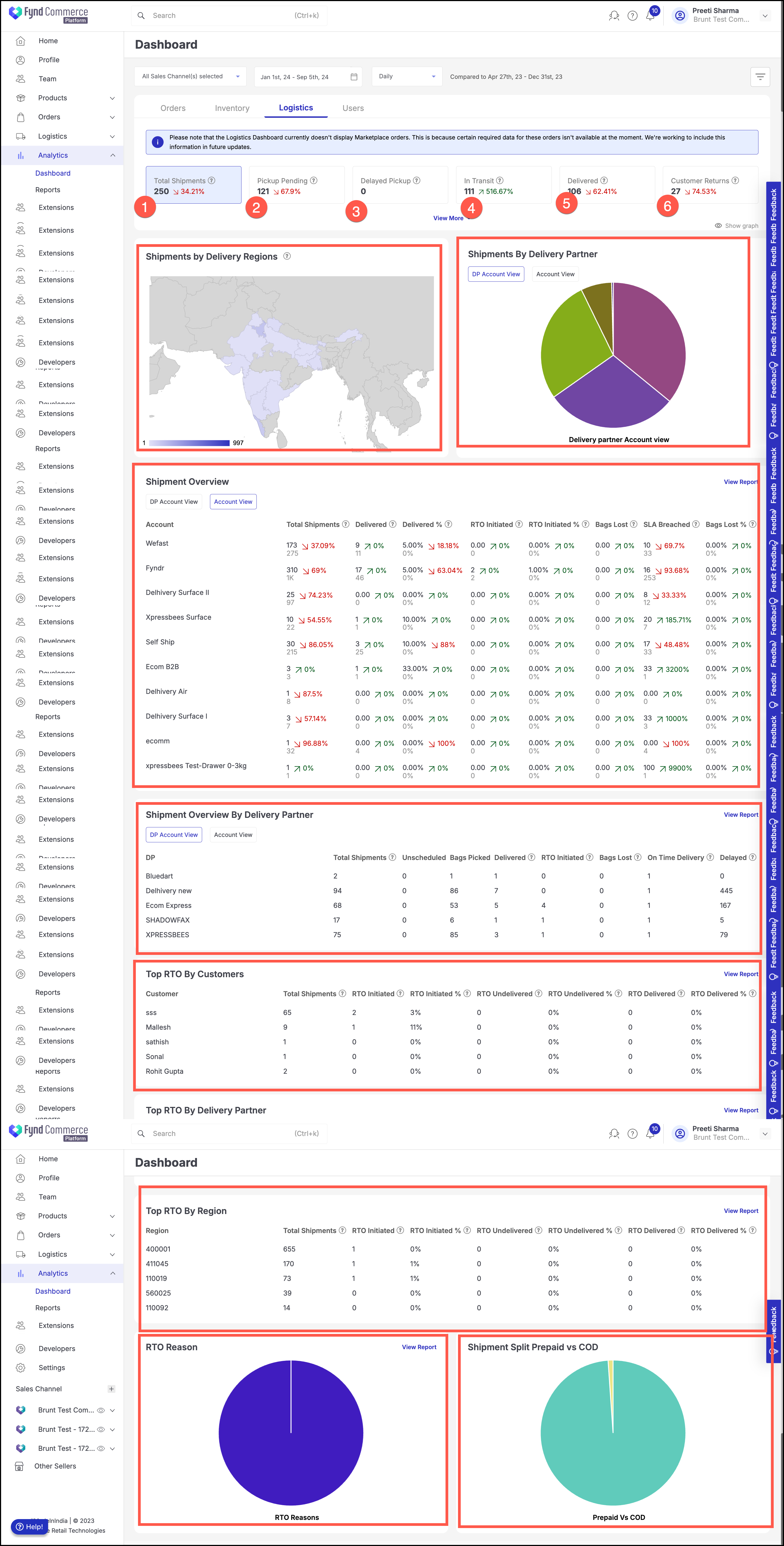
Logistics
This dashboard offers sellers comprehensive visibility into their shipping operations. By providing insights into shipments, delivery partner performance, RTO reasons, and regional trends, sellers can optimize their logistics, improve delivery reliability, and reduce returns.
Please note that the Logistics Dashboard currently doesn't display Marketplace orders. This is because certain required data for these orders isn't available at the moment. We're working to include this information in future updates.
-
Total Shipments: This field shows the total number of shipments processed. It provides a quick overview of shipping activity. A significant change indicates a rise or drop in order fulfillment.
-
Pickup Pending: The number of shipments that are yet to be picked up by the delivery partner.This metric helps sellers track shipments that are ready but waiting to be picked up for delivery. A higher number could indicate delays in pickups.
-
Delayed Pickup: This metric tracks the number of shipments that have experienced a delay in pickup. A delay in pickup can disrupt the delivery process. Keeping this number low is crucial for smooth logistics.
-
In Transit: This metric tracks shipments that are currently on their way to the customer. It shows the active movement of orders toward customers. A significant increase indicates that many shipments are currently in progress.
-
Delivered: This metric tracks the number of shipments successfully delivered. It helps sellers track completed shipments. A decrease could indicate delivery issues or fewer completed orders.
-
Customer Returns: The number of shipments that have been returned by customers.It helps track returned items. An increase in customer returns might indicate issues with product quality, wrong shipments, or customer dissatisfaction.
-
Total RTO: This metric tracks the total count of orders that could not be delivered and were returned to the seller’s warehouse or origin. A lower total RTO indicates fewer failed deliveries, which is a positive sign.
-
RTO Percentage: This metric shows the proportion of shipments that failed and were returned. The large percentage increase suggests a significant rise in returns relative to the number of shipments, which may indicate underlying issues such as delivery problems or customer dissatisfaction.
-
RTO Initiated: This metric tracks when the RTO process starts, such as when the customer refuses delivery or the delivery fails. A decrease in RTO initiated suggests improvements in the delivery process or better customer satisfaction.
-
RTO Undelivered: This metric tracks how many returned shipments were still not returned to the origin after an RTO was initiated. A decrease to zero indicates that all initiated RTOs have successfully returned to the origin, showing a smooth reverse logistics process.
-
RTO Delivered: This shows how many of the initiated RTO shipments have successfully been delivered back to the origin. A decrease to zero means no new deliveries from the RTO process have been completed, potentially because the period had few returns or was yet to finalize returns.
-
RTO Shipments: This matrics tracks the overall success rate of shipments that completed the return journey to the seller. The sharp decrease indicates far fewer completed returns in this period compared to the previous one, possibly due to fewer total shipments or fewer delivery failures.
The selected metrics will display their corresponding graph on the dashboard.
Shipments by Delivery Regions
A map showing the density of shipments by delivery regions. It helps sellers identify geographical areas with the highest shipment volume, allowing for targeted logistical strategies based on regional demand.
Shipments by Delivery Partner (Pie Chart)
This pie chart provides a breakdown of shipments based on different delivery partners. It helps sellers understand which delivery partners are handling the most shipments, allowing them to evaluate partner performance.
Shipment Overview by Delivery Partner
It is a detailed table displaying shipment statistics for each delivery partner, such as total shipments, bags picked, RTO initiated, and on-time deliveries.This section helps sellers assess the performance of each delivery partner in terms of efficiency and reliability. For example, high delayed pickups or returns may indicate issues with a specific partner.
Top RTO (Return to Origin) by Customers
It is a table showing which customers initiated the most RTOs (shipments returned to the seller). It helps sellers identify problematic customer segments or locations with high return rates. Understanding this can help improve delivery processes or product quality.
Top RTO by Delivery Partner
This table shows how many shipments were returned to the seller, broken down by delivery partners.It allows sellers to track which delivery partners have the highest return rates. High RTO rates may indicate delivery issues that need to be addressed with the partner.
Top RTO by Region
It is a table showing regions where RTOs were initiated, including total shipments and percentage of returns.It helps identify regions where deliveries are more likely to be returned. This may be due to incorrect addresses, poor delivery service, or customer dissatisfaction in specific regions.
RTO Reason
This pie chart breaks down the reasons why shipments were returned. It helps sellers understand the main reasons for returns. Common reasons might include customer refusals, failed deliveries, or incorrect shipments.
Shipment Split Prepaid vs COD
A pie chart that divides shipments between Prepaid and Cash on Delivery (COD) options. This allows sellers to track customer payment preferences. If COD shipments have higher return rates, sellers may reconsider offering this option or target improvements in the process.
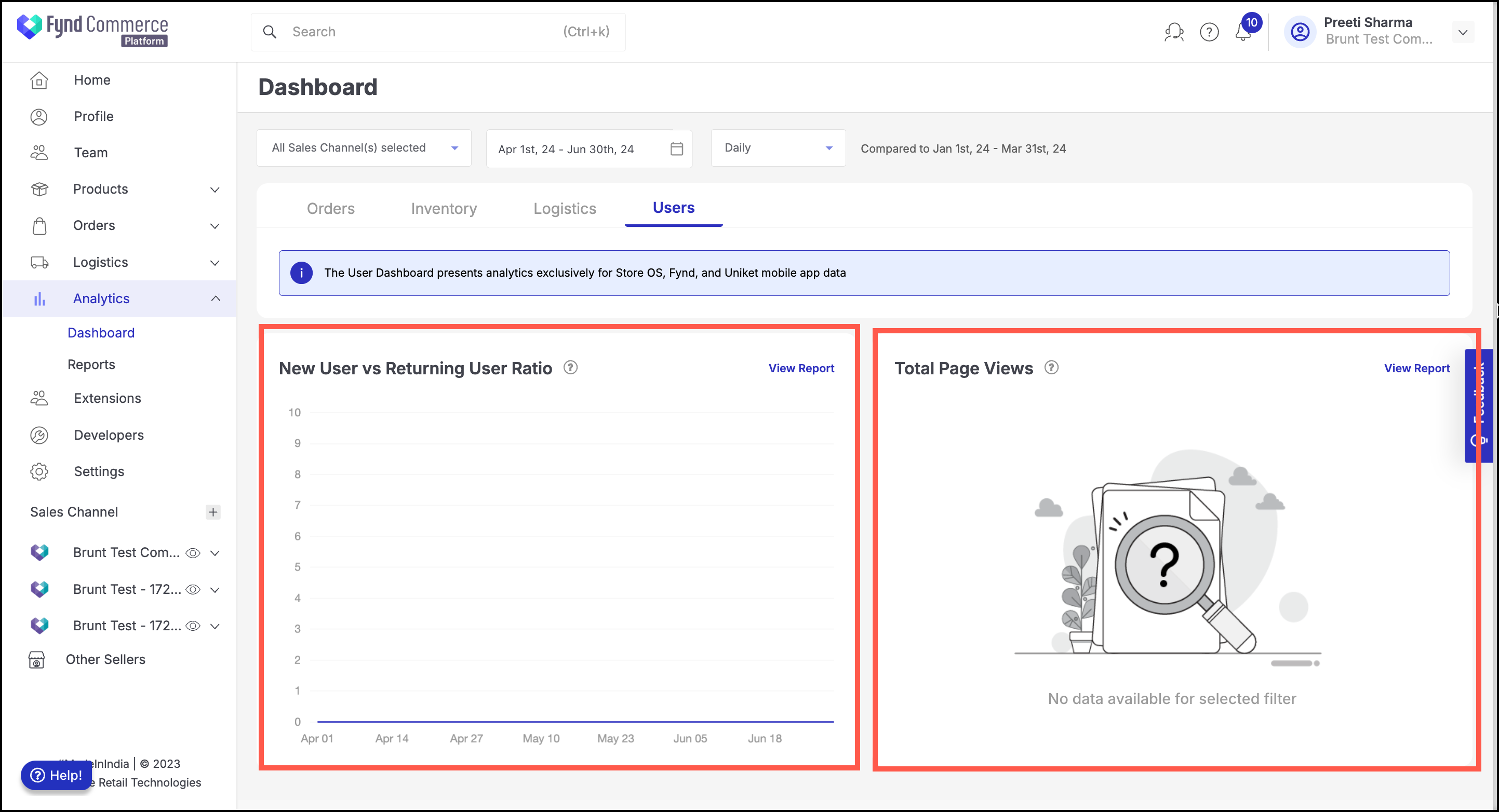
Users
User Dashboard provides analytics specifically for data coming from Store OS, Fynd, and Uniket mobile app. It provides key analytics related to user behaviour.
New User vs Returning User Ratio
This graph tracks the ratio of new users (first-time visitors) versus returning users (those who have visited or purchased before) over a specified time frame. A high percentage of new users could indicate effective marketing or strong interest in your offerings. A high percentage of returning users suggests customer loyalty and satisfaction. Tracking this metric helps understand user behavior patterns, retention, and acquisition efforts.
Total Page Views
This section displays the total number of page views for your store across the selected platforms. The graph is currently not showing any data for the selected period. It tracks the overall engagement with the store, showing how often users are browsing different pages. High page views can indicate user interest, while low views may suggest the need for better promotion or more engaging content.