Settings are the fundamental parameters that govern the foundational configuration of your website. These settings encompass a broad range of options, such as general settings, header settings, footer settings, typography settings, and other fundamental settings that are essential for the establishment of your website.
Below are the configurable settings of the Gala theme:
General Setting
The general settings constitute of the colour palette of the Gala theme. It is a set of colours used consistently in a website's design to create a specific mood or tone. It includes primary and secondary colours as well as accent colours.
A well-designed colour palette unifies a website's elements and enhances its visual appeal, reinforcing its brand identity. colour choices are made based on factors such as the target audience, industry, and intended use of the website.
Below are the further configurable options in general setting:
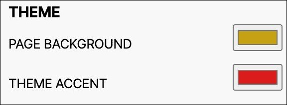
1. Theme
-
PAGE BACKGROUND:
The page background colour of an e-commerce website refers to the colour that appears behind the content of the website. This can include the background main content area excluding the header and footer. This option allows for the customisation of background colour of all pages on the website.
Use this option to adjust the colour of your e-commerce site's background, including the main area.
-
THEME ACCENT:
The theme accent colour of an e-commerce website refers to the colour that is used to highlight important elements of the website, such as the sub-menu of the hero menu or the description background of the product listing page.
Use this option to customise accent colour to highlight key elements like hero menu sub-menu or product listing page description.
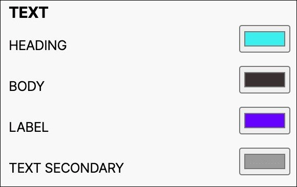
2. Text
-
HEADING:
The heading text colour of a website refers to the colour of the text used for the main headings and titles on a web page.
Use this option to customise main headings and titles on a web page.
-
BODY:
The body text colour refers to the colour of the main text content on a website. This includes the text that appears in paragraphs, lists, and other text-based elements throughout the site.
Use this option to modify the colour of the main text content on a website, including paragraphs and lists.
-
LABEL:
The label text colour refers to the colour of the text used to label different fields and elements on an e-commerce website. This includes the text used for product descriptions, pricing information, product highlights and other details related to the products being sold.
Use this option to modify the colour of text used for labelling fields and product details on an e-commerce website.
-
TEXT SECONDARY:
The "text secondary" of an e-commerce website refers to the colour of the text that appears on any disabled or inactive buttons, links, or fields. This could include buttons that are greyed out because they are unavailable, links that are not clickable, or form fields that are read-only.
Use this option to modify the colour of text that appears on inactive buttons, links, or fields.
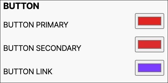
3. Button
-
BUTTON PRIMARY:
The primary button colour of an e-commerce website is the main colour used for buttons that represent the most important actions on the site. The call-to-action buttons that can be customised include the hero image button and the checkout button on the product description page or the view more button on the product listing page.
Use this option to modify the primary colour used for important website actions/buttons, such as checkout and view more buttons.
-
BUTTON SECONDARY:
The secondary button colour of an e-commerce website is usually used for non-primary actions such as “Add to cart”, "Cancel" or "Go Back". This option enables the customisation of the colour of secondary buttons across the entire webpage.
Use this option to modify the button colour of non-primary actions such as "Add to Cart", "Cancel" and can be customised site-wide.
-
BUTTON LINK:
A standalone text with no background to navigate online content. Use this option to modify the colour of button link.
4. Discount
-
BADGE BACKGROUND:
The discount badge background colour refers to the colour used to display the price of the product before the discount. Ideally- price after discount.
Use this option to modify the colour of the discount badge background across the entire webpage.
-
BADGE TEXT:
Badge texts are often used to indicate a specific status, such as "new" or "featured," or to indicate a certain action, such as "download" or "subscribe." They can also be used to display awards, certifications, or affiliations of a website or its content.
Use this option to modify the badge text colour in the sales section of the website, customisable site-wide.
-
DISCOUNT TEXT:
The discount text colour of an e-commerce website refers to the colour used to display the percentage of discount on that product.
Use this option enables to modify the the colour of discount badge text across the entire webpage.
-
TIMER:
Timers measure specific time intervals, displaying a countdown clock until an offer expires. Use this option to modify the colour of the timer on your website.
5. Header
In a website, the header typically refers to the top section of a webpage that contains the site's logo, navigation menu, and other key elements such as search bar or social media icons.
-
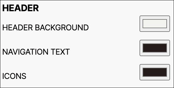
HEADER BACKGROUND:
The header background colour of an e-commerce website refers to the colour of the background behind the header section of the website. This typically includes the logo, navigation menu, and any other elements that appear at the top of the page.
Use this option to modify the colour the colour header background across the entire webpage.
-
NAVIGATION TEXT:
Navigation text in a footer of a website refers to the links or menu options displayed at the bottom of the webpage, which allow users to access different pages or sections of the website.
Use this option to modify the colour of the navigation text in the header section across the entire webpage.
-
ICONS:
The header icon colour of an e-commerce website refers to the colour of the icons displayed on the header section of the website, such as the search icon, shopping cart icon, and menu icon.
Use this option to modify the colour of the icon in the header section across the entire webpage.
6. Footer
A footer in a website is a section that appears at the bottom of every page and typically contains information such as copyright notices, contact information, links to important pages, and sometimes a site map or search bar.
-
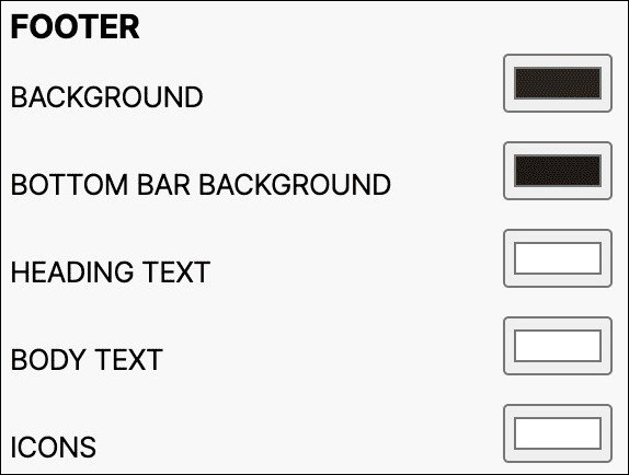
BACKGROUND:
The footer background colour of an e-commerce website refers to the colour of the background behind the footer section of the website.
Use this option to modify the colour footer background across the entire webpage.
-
BOTTOM BAR BACKGROUND:
The bottom bar background in a footer of a website is the background color or image that appears at the bottom of the web page, below the main content and above the page footer. It is a design element used to provide visual continuity and enhance the overall aesthetic of the website.
Use this option to modify the colour of the bottom bar background of the footer across the entire webpage.
-
HEADING TEXT:
Heading text in a footer of a website is a short and concise text that is used to label or identify the content of a specific section in the website's footer. It typically appears in larger and bolder font than the surrounding text to make it stand out and to help users quickly find the information they are looking for.
Use this option to modify the colour of the heading text in the footer section across the entire webpage.
-
BODY TEXT:
Body text in a footer on a website refers to the written content located at the bottom of a web page, often containing important information such as copyright notices, contact information, links to terms of service and privacy policy pages, and other relevant details about the website or its owners.
Use this option to modify the colour of the body text in the footer section across the entire webpage.
-
ICONS:
The footer icon colour of an e-commerce website refers to the colour of the icons displayed on the footer section of the website, such as the extension icons, shopping cart icons, and menu icons.
Use this option to modify the colour of the icon in the footer section across the entire webpage.
7. Overlay Popup
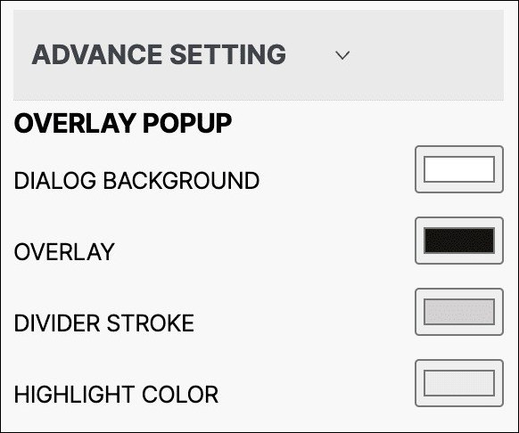
Overlay_colour are used with alpha value (Opacity) of 60%. Pop-up_bg_colours are usually equal or lighter to the background colour of the website.
-
DIALOG BACKGROUND:
The dialogue background in an overlay popup on a website is the translucent or opaque layer that appears behind the popup box, serving to dim or blur the background content and bring focus to the popup.
Use this option to create contrast and focus attention on the content within a dialog box or pop-up.
-
OVERLAY:
An overlay in an overlay popup in a website refers to a semi-transparent layer that is displayed on top of the existing webpage content to highlight or emphasise specific information or functionality.
Use this option to add visual interest and depth by darkening or lightening an area of the website.
-
DIVIDER STROKE:
A divider stroke in an overlay popup on a website is a line or border that separates or divides different sections of content within the popup.
Use this option to separate different sections or elements on a website, making it easier to navigate.
-
HIGHLIGHT COLOUR:
Highlight color in an overlay popup on a website is a visually distinct color that is used to draw attention to a specific element or message within the popup. It is typically a bright or contrasting color that stands out from the rest of the popup's design, making it more noticeable to the user.
Use this option to draw attention to specific elements or actions on a website, encouraging user engagement.
8. User Alert
A user alert in a website is a notification or message that is displayed to a user to inform them about important events, actions, or errors on the website. It is used to grab the user's attention and provide them with relevant information to enhance their user experience.
-
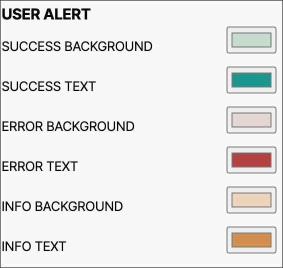
SUCCESS BACKGROUND/SUCCESS TEXT:
SUCCESS BACKGROUND and SUCCESS TEXT are colors used to indicate successful actions or operations on a website. They create a positive and optimistic impression for the user.
Use this option to modify the colours of success background and success text in your website.
-
ERROR BACKGROUND/ERROR TEXT:
ERROR BACKGROUND and ERROR TEXT are colors used to indicate errors or warnings on a website. They create a sense of urgency and caution for the user.
Use this option to modify the colours of error background and error text in your website.
-
INFO BACKGROUND/INFO TEXT:
INFO BACKGROUND and INFO TEXT are colors used to indicate general information or notifications on a website. They create a neutral and informative impression for the user.
Use this option to modify the colours of info background and info text in your website.
9. Font
Fonts are important in creating a visually appealing and legible design for written content. Choosing the right font can enhance the overall look and feel of the content and convey the intended message more effectively. Here font option is provided that allows the user to select the font for the website text.
Use the dropdown menu to choose your font.
10. Authentication
An authentication page in a website is a webpage that requires users to provide some form of identification or credentials to gain access to a restricted area of the website or perform a certain action. The purpose of an authentication page is to ensure that only authorised users can access sensitive or private information, such as personal data, financial transactions, or confidential documents.
This option allows you to provide the option of header/footer on authentication pages.
- SHOW HEADER: Select the check mark to make the header available during the login screen.
- SHOW FOOTER: Select the check mark to make the footer available during the login screen.
11. Extension Positions
The extension positions in the extension section of a website refer to the specific locations or areas on a web page where browser extensions or add-ons can be displayed or integrated.
Below are the positions where you can add extension sections:
- Header Top
- Header Bottom
- Footer Top
- Footer Bottom
Typography
Typography in a website refers to the visual arrangement and design of the text on a webpage, including its style, size, color, spacing, and font selection. It is an important aspect of web design as it can significantly impact the readability, accessibility, and aesthetic appeal of the content displayed on a webpage.
It includes options to customise the font family, weight, line height, and other elements. Typography affects how easy it is to read and use your website, so it's important to configure these settings carefully.
Below are the further configurable options in typography setting:
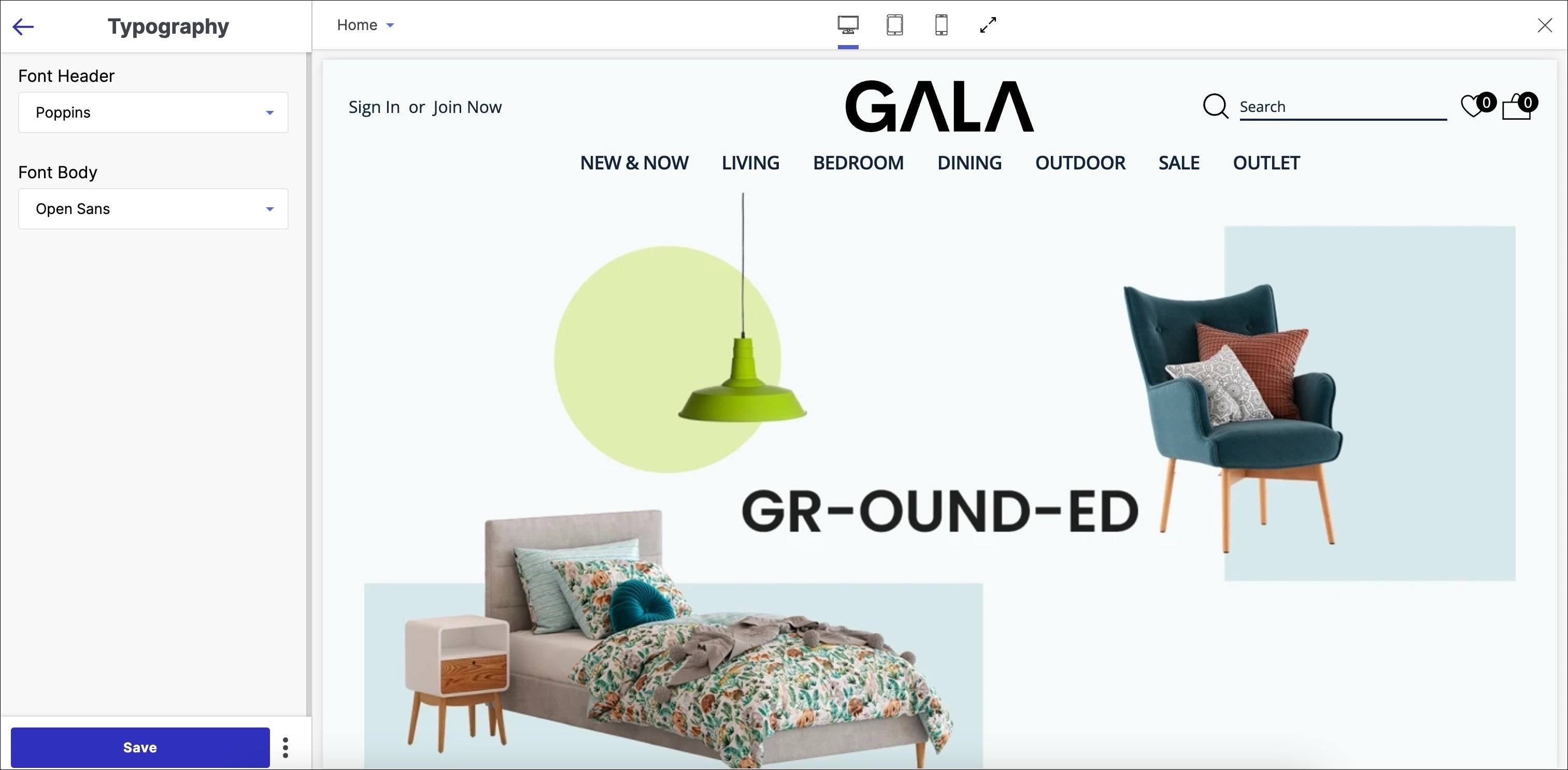
1. Font Header
A font header in the typography section of a website refers to the typeface used for the main heading or title on a webpage.
From the drop-down menu, choose the base font header.
2. Font Body
The font body in typography refers to the primary typeface used for the main content on a website, such as paragraphs, articles, and blog posts. It is typically a legible and easy-to-read font that is selected to improve the readability of the website content.
From the drop-down menu, choose the base font body.
Header
The header of a website is the top section that typically appears on every page of the website. It usually contains important information and navigational elements, such as the website logo, main menu, search bar, and social media icons. The purpose of the header is to provide visitors with a quick overview of the website's identity, purpose, and content, as well as to facilitate easy access to different sections of the website.
Below are the further configurable options in header setting:
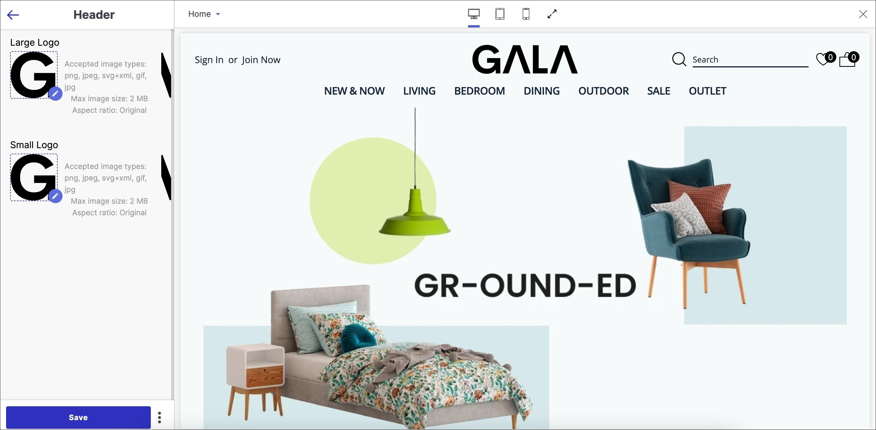
In the header customisation, there are two options available: Large Logo and Small Logo.
1. Large Logo
A large logo in the header section of a website is a graphic representation of a brand or website's identity. It is usually placed at the top of the website's page, above the main navigation menu and other content, and is often the first thing visitors see when they arrive at the site.
Upload the large logo image by clicking on the pen icon.
2. Small Logo
A small logo in the header section of a website typically represents the brand or company associated with the website. It's a visual symbol that helps visitors quickly identify and associate the website with the brand or company.
Upload the small logo image by clicking on the pen icon.
The category bar (navigation) in the header section can contain a maximum of 2 sub-navigation columns. To achieve this using Fynd Platform, we will label these sub-navigations as Column_1 and Column_2. There should not be a Column_3 or any additional columns. The UI will only display up to Level 2 sub-navigation; anything beyond that will not be shown.
To access the navigations tab and modify menu items:
Sales Channel > Appearance > Navigation > Gala > Menu Items
Cart
The cart icon appears in the header section of your store page. A cart is a feature on a website that lets visitors see product pages and add items to their shopping basket.
Below are the further configurable options in cart setting:
- Disable cart
Disabling the cart in a website means preventing customers from adding products to their shopping cart or making purchases on the site. It can be done for various reasons, such as when a website is temporarily closed for maintenance or when a product is out of stock.
If you want to remove the cart icon from the menu items in the header section, check the disable cart tick-box.
Footer
The footer of a website is the bottom section that usually appears on every page of the website. This can include elements such as copyright notices, contact details, links to important pages, legal disclaimers, and social media icons. The footer can also contain additional navigational elements, menu or call-to-action buttons, such as a "subscribe to the newsletter" button or a "back to top" link.
Below are the further configurable options in footer setting:
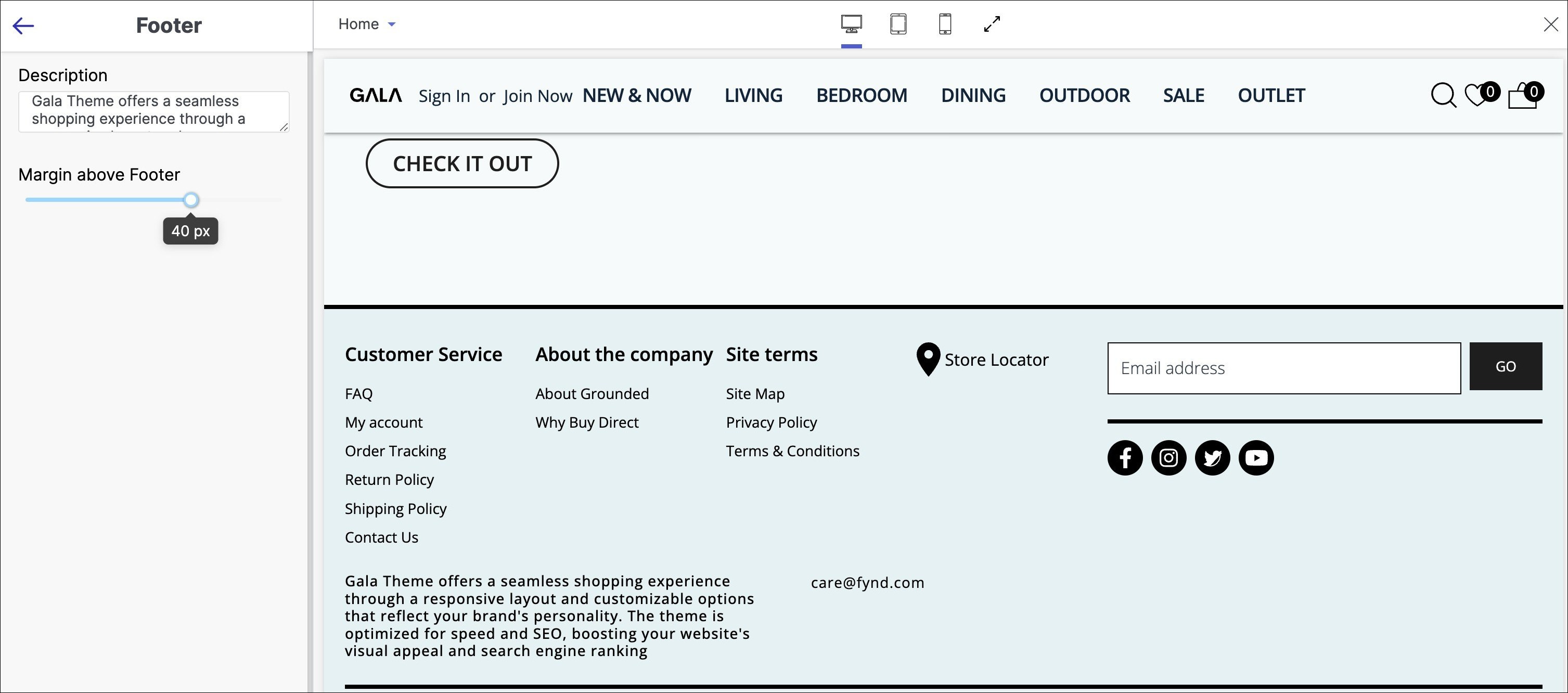
1. Description
In a website, the description in the footer is a brief text that provides information about the website or its content, typically displayed at the bottom of each page.
Use this option to add a brief description and important details about your business.
2. Margin above Footer
Margin above footer refers to the space or gap between the bottom of the main content of a web page and the top of the footer section.
Use the slider to adjust the margin above footer.
Page
The Home page is typically the main landing page of a website or application and serves as the primary point of entry for users. The purpose of the Home page is to provide an overview of the website or application and to direct users to other sections or pages as needed.
Below are the further configurable options in page setting:
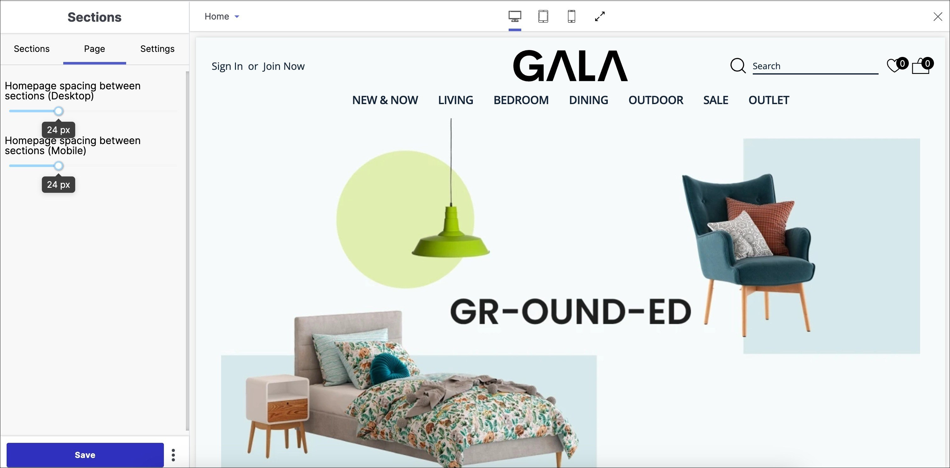
1. Homepage Spacing between Sections (Desktop)
Use the slider to modify homepage the amount of vertical space between different sections of a website's homepage on a desktop computer or laptop screen.
2. Homepage Spacing between Sections (Mobile)
Use the slider to modify homepage the amount of vertical space between different sections of a website's homepage on a mobile screen.